
Branding projects:how a brand gets built.
Identities that grew out of strategy: name, archetypes, symbol, colors and applications. Every project starts by understanding the business, before a single line is drawn.
 Bullcom: View project
 Expo Orquídea: View project
 Intelitrans: View project
 Personalizei: View project
 Libelle Group: View project
 Varejo Tributário: View project
 Ciência das Orquídeas: View project
 Fidelize.me: View project
 Saudações Financeiras: View project
 Livato: View project
 De Biagi: View project
 Aline Vicente: View project
 Grupo Rarah: View project
 Leticia Nunes: View project
 UNIC: View project
 Rabisco: View project
 SW Manifesto: View project
Hover over or tap a project to see the brand.
Bullcom
Concept
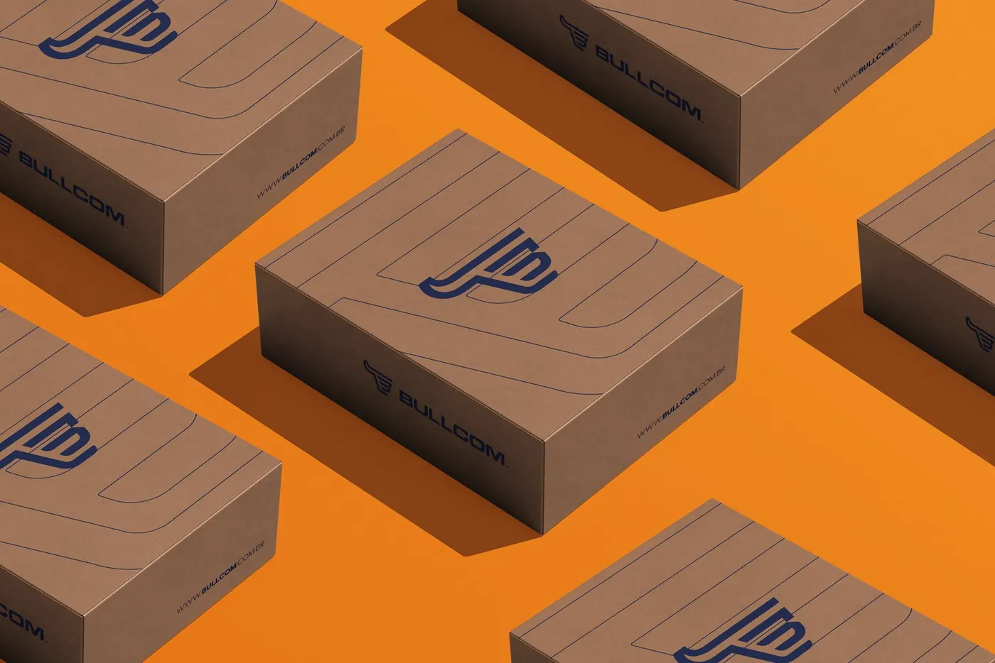
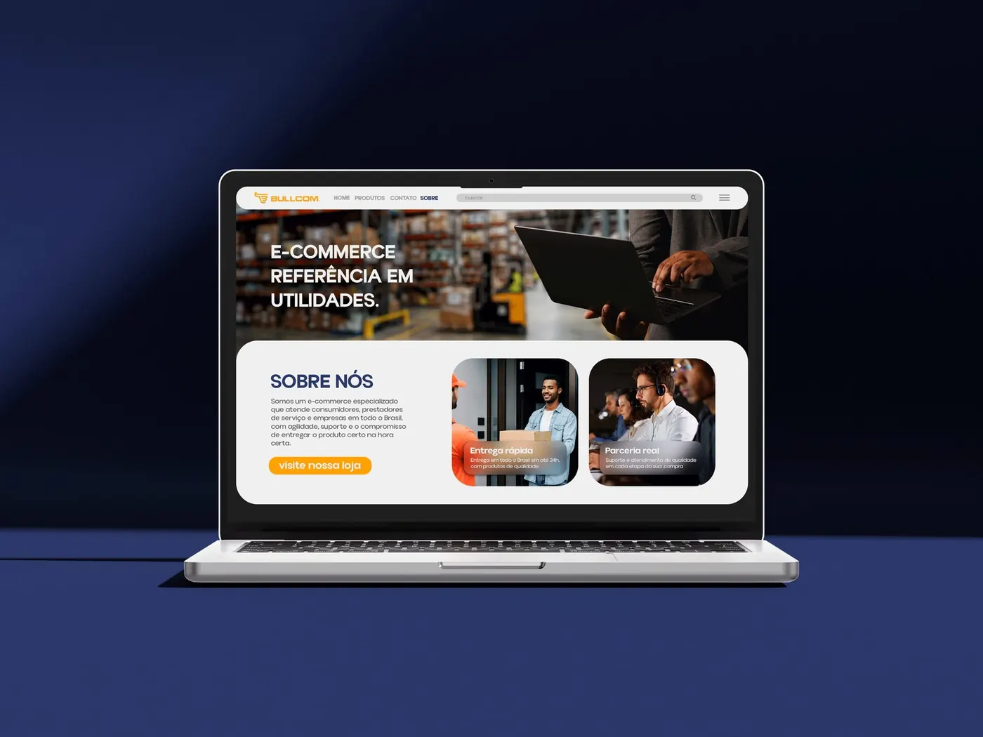
- Bring the brand out from behind the products: Bullcom sold well on marketplaces, but few people remembered the name. The identity was designed to support a channel of its own and growth in B2B.
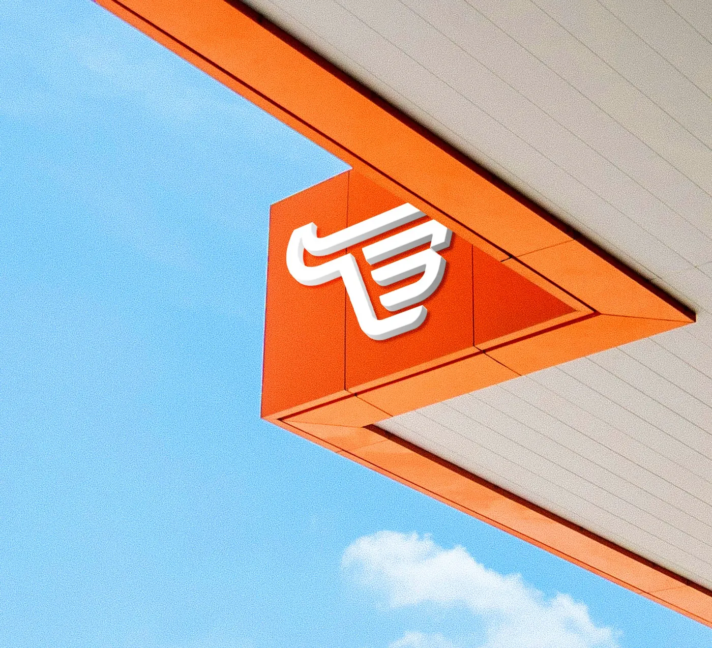
- The symbol is built on the letter B, with straight, structured strokes that recall the silhouette of a bull and, subtly, a shopping cart.
- Orange and blue, to break away from the yellow and black that are common in the industry: orange brings energy and speed; blue brings solidity and trust.
Deliverables
- M.A.P.A. Diagnosis
- Logo, symbol and variations
- Color palette and typography
- Brand identity guidelines
- Packaging, storefront and website mockups
Strategy and direction: Arantho Design: Moka Studio


Expo Orquídea
Concept
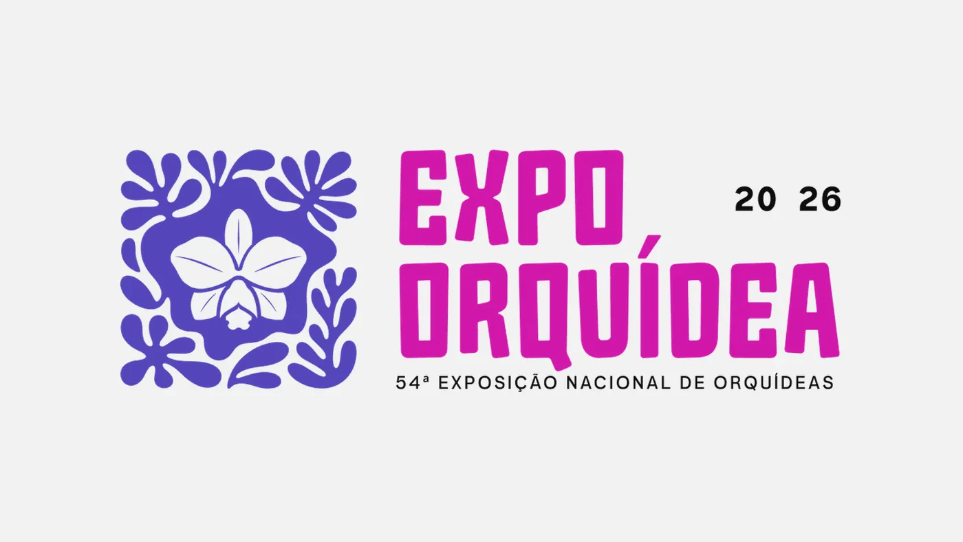
- At the center of the symbol, the silhouette of a Cattleya loddigesii appears in the negative space: the flower is not drawn, it is discovered.
- The organic shapes around it (leaves, roots and petals) stand for the community of orchid growers, because no orchid blooms alone. The square brings the structure and tradition of the event.
- Brand tagline: “Onde o amor por orquídeas floresce em comunidade” (Where a love of orchids blooms in community).
Deliverables
- Briefing and debriefing
- Brand presentation and manifesto
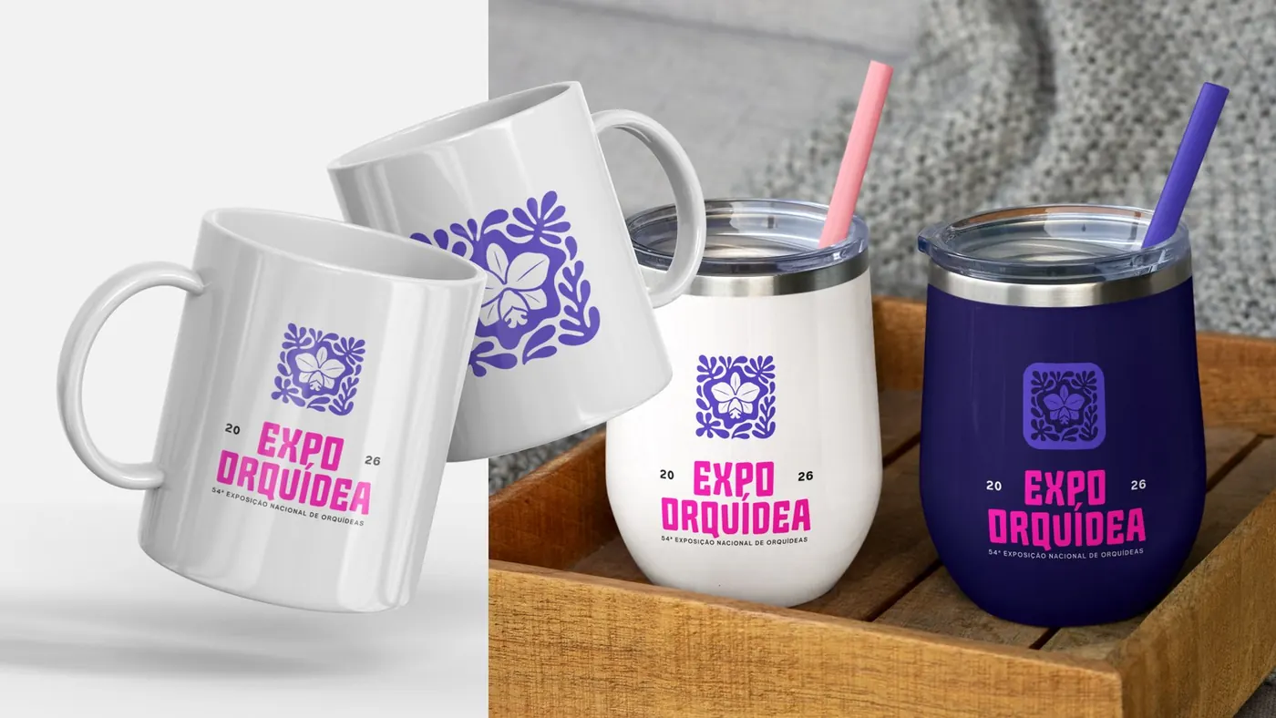
- Logo, lockup and icon
- Color and typography guide
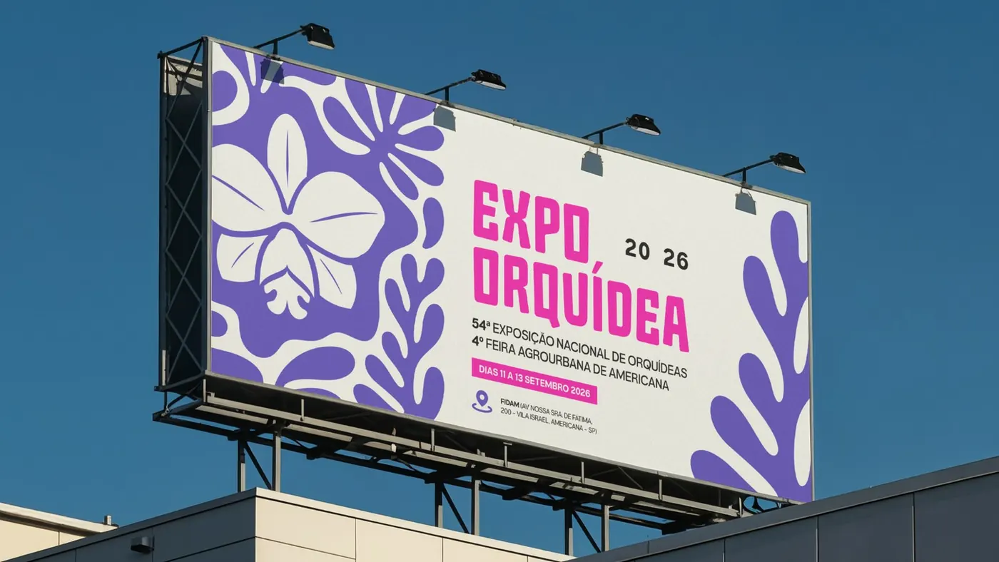
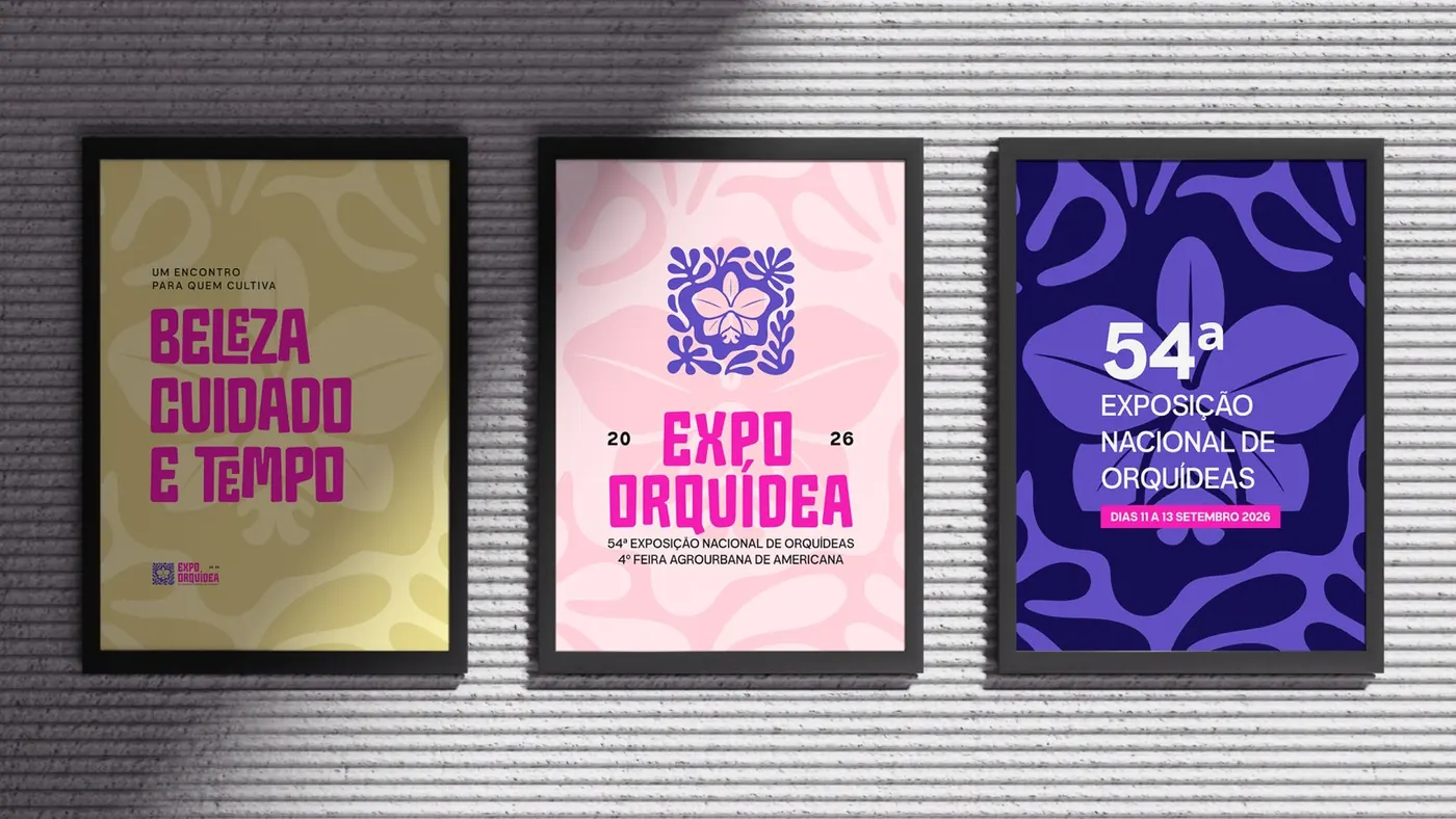
- Event materials: billboard, posters, badges and Instagram Stories
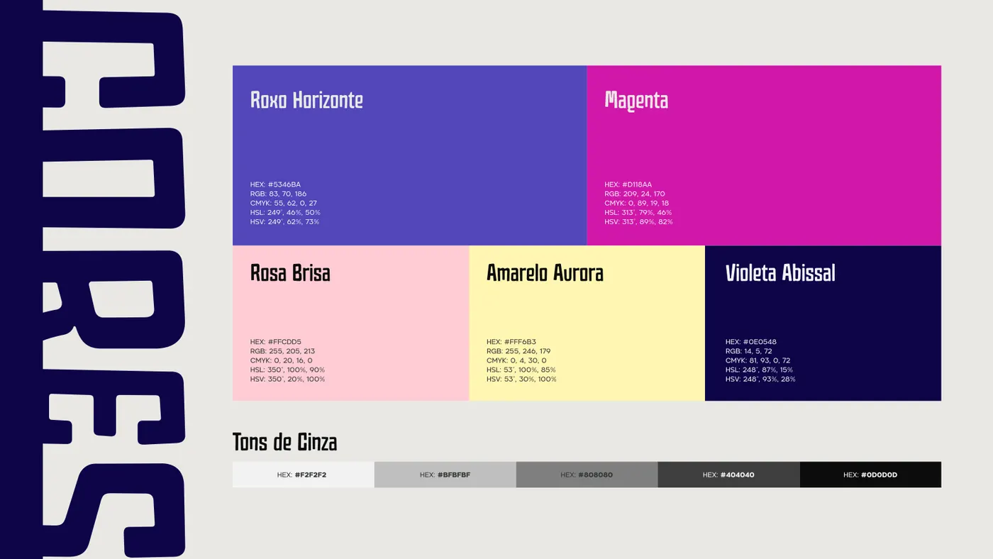
Palette
#5346BA#D118AA#0E0548#FFCDD5#FFF6B3
Strategy and direction: Arantho Design: Eliel Freitas
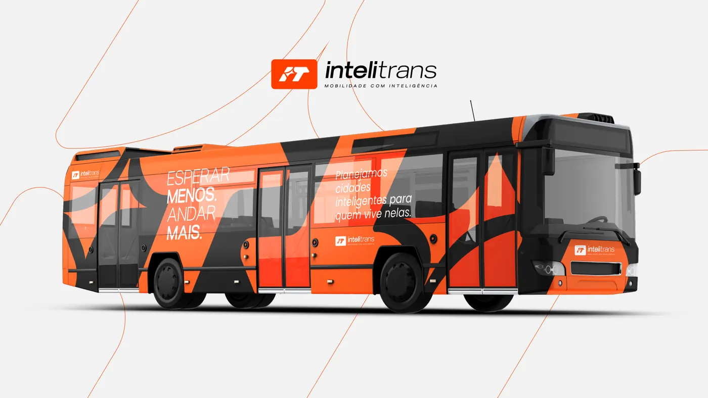
Intelitrans
Concept
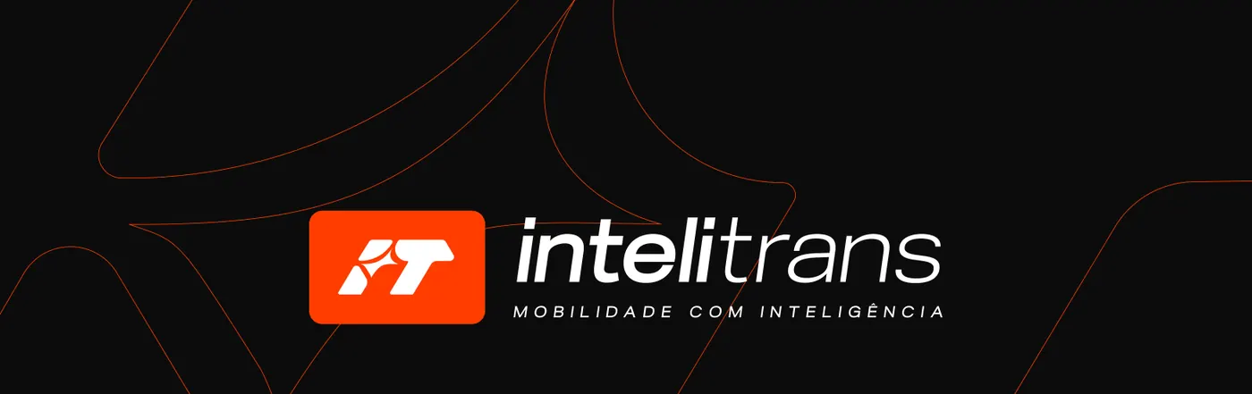
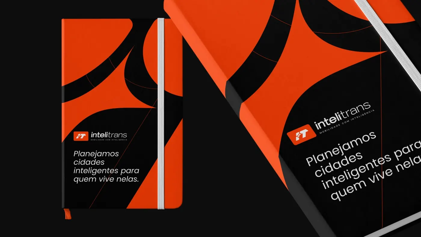
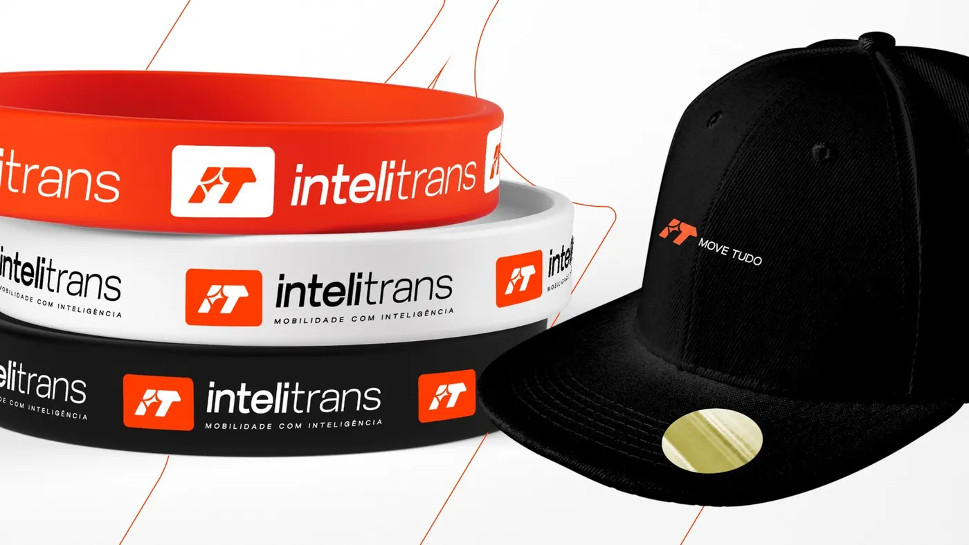
- The icon starts from the initials and works as a smart urban node: connected shapes and inner curves that recall roads, intersections and routes.
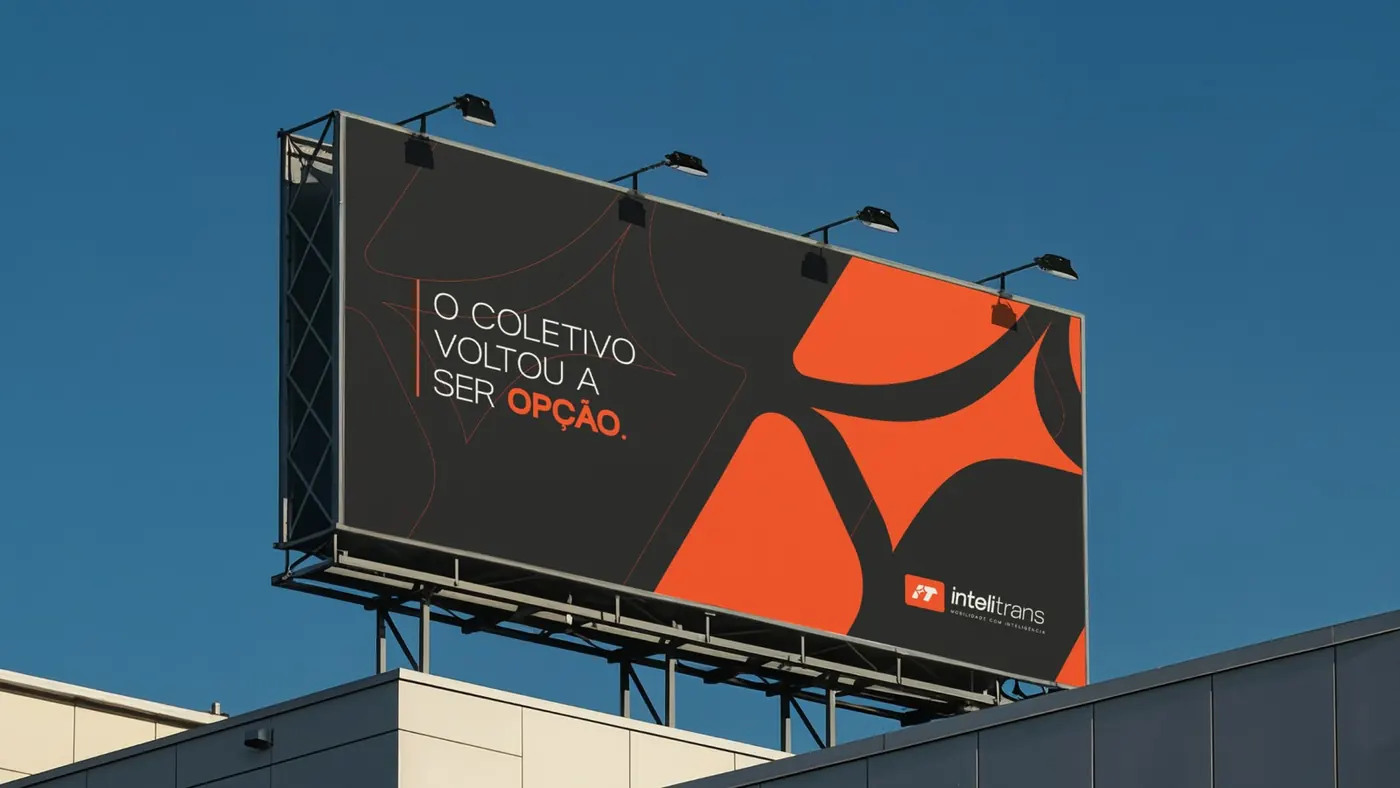
- Red Orange is the color of movement with purpose, bringing together urgency and human warmth.
- Manifesto: urban mobility isn't about buses, rails or data. It's about people.
Deliverables
- Market study and strategic diagnosis
- Brand presentation, purpose and manifesto
- Logo and IT icon
- Lockup and sub-brand architecture
- Palette, typography and mockups
Strategy and direction: Arantho
Personalizei
Concept
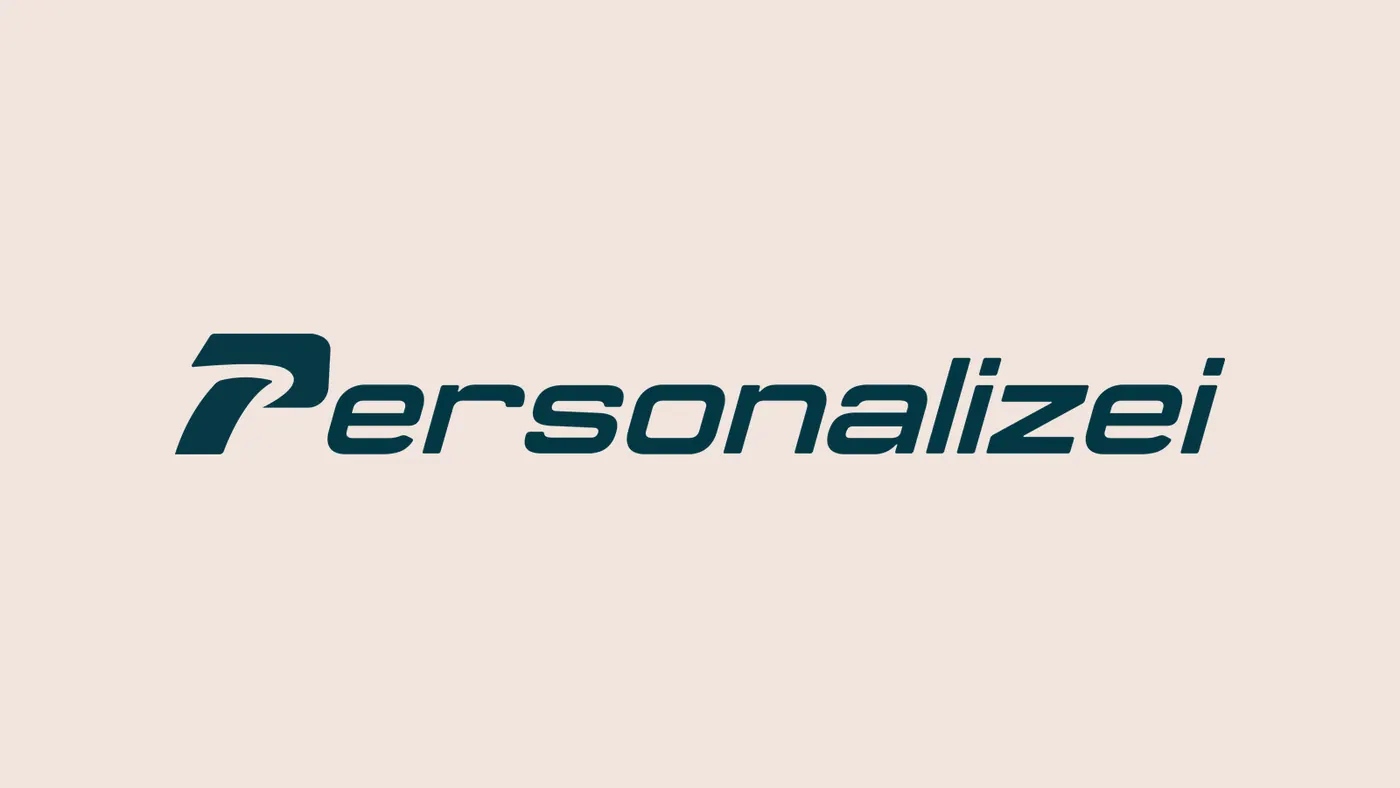
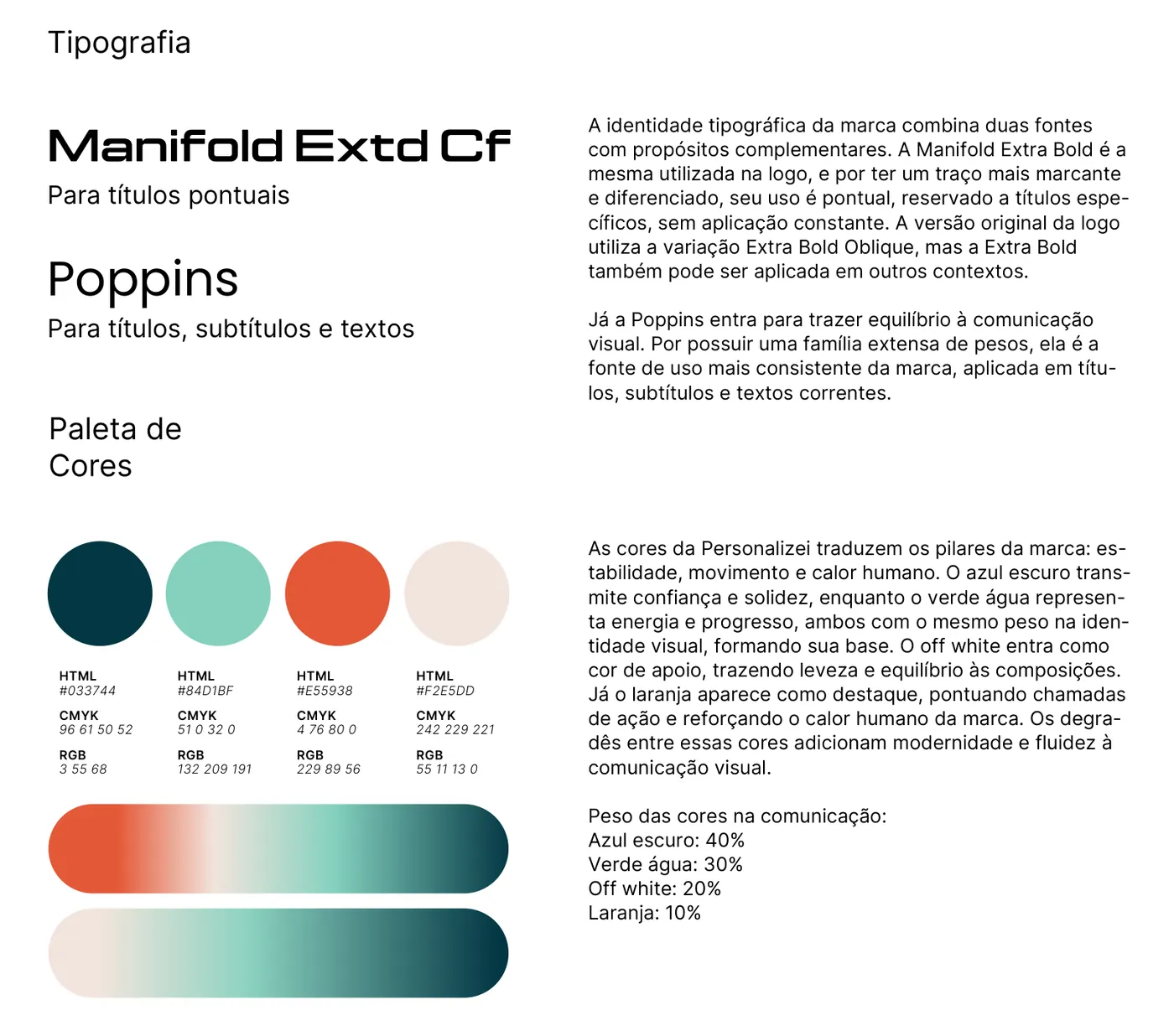
- The name was reframed as a first-person verb: “eu personalizei” (I personalized it). The trainer is the one who acts, not the app. In one line: “O treino é seu. O resto é com a gente.” (The workout is yours. We handle the rest.)
- Archetype triad: Caregiver at the core (caring for the people who care for everyone else), Everyman in the voice and Creator as the differentiator.
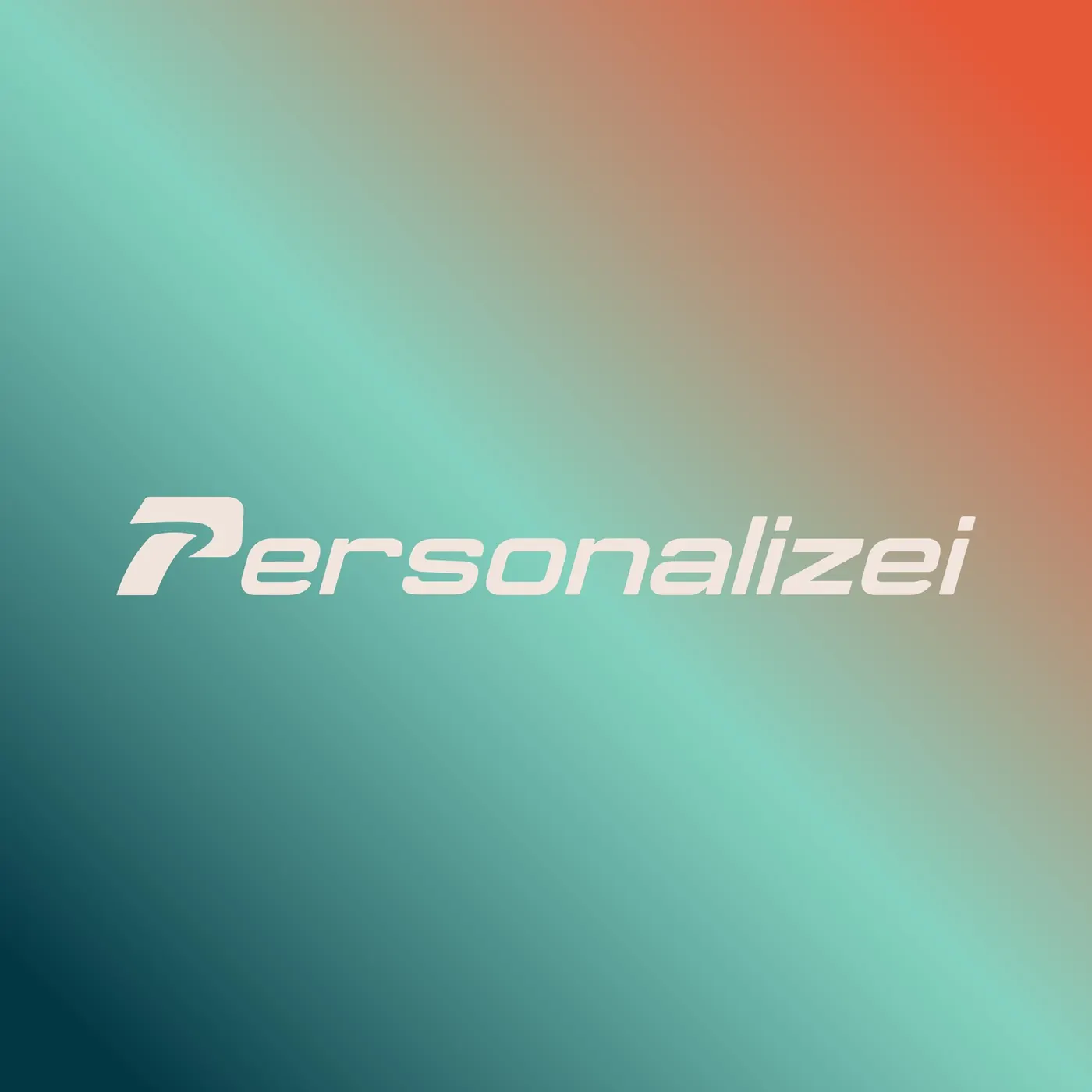
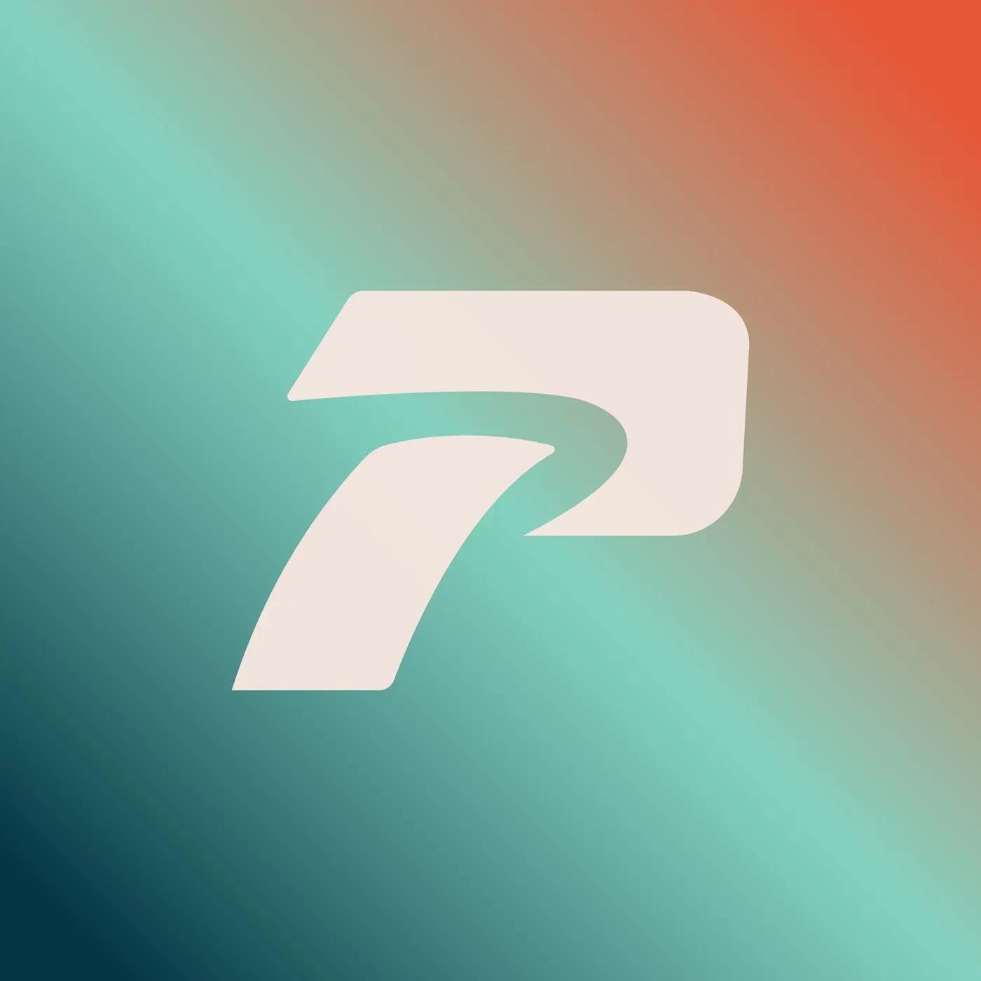
- The symbol grows out of the letter P, with rounded curves and tips that convey movement and performance without slipping into a rigid tech look.
Deliverables
- M.A.P.A. Diagnosis
- Reframing the name
- Verbal and visual identity brief
- Logo and symbol
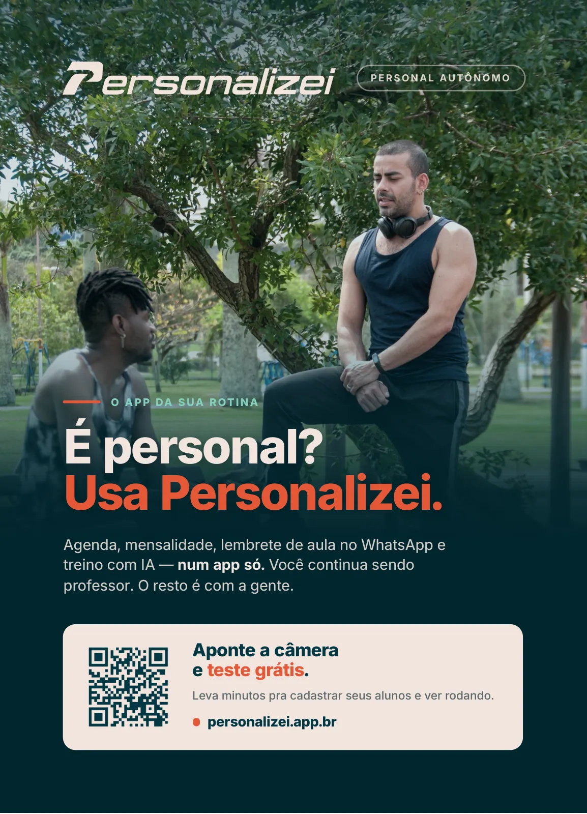
- Palette, typography and flyer
Palette
#033744#84D1BF#F2E5DD#E55938
Strategy and direction: Arantho
Libelle Group
Concept
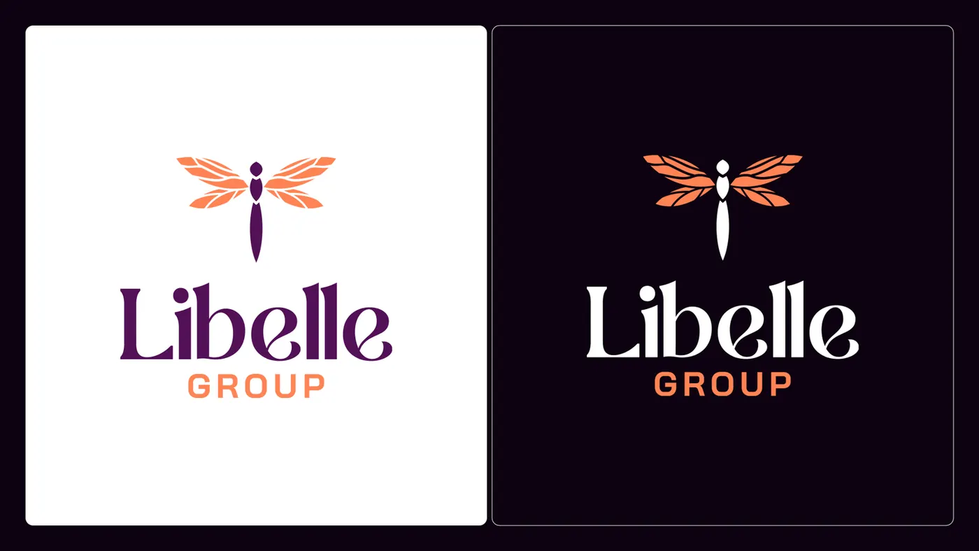
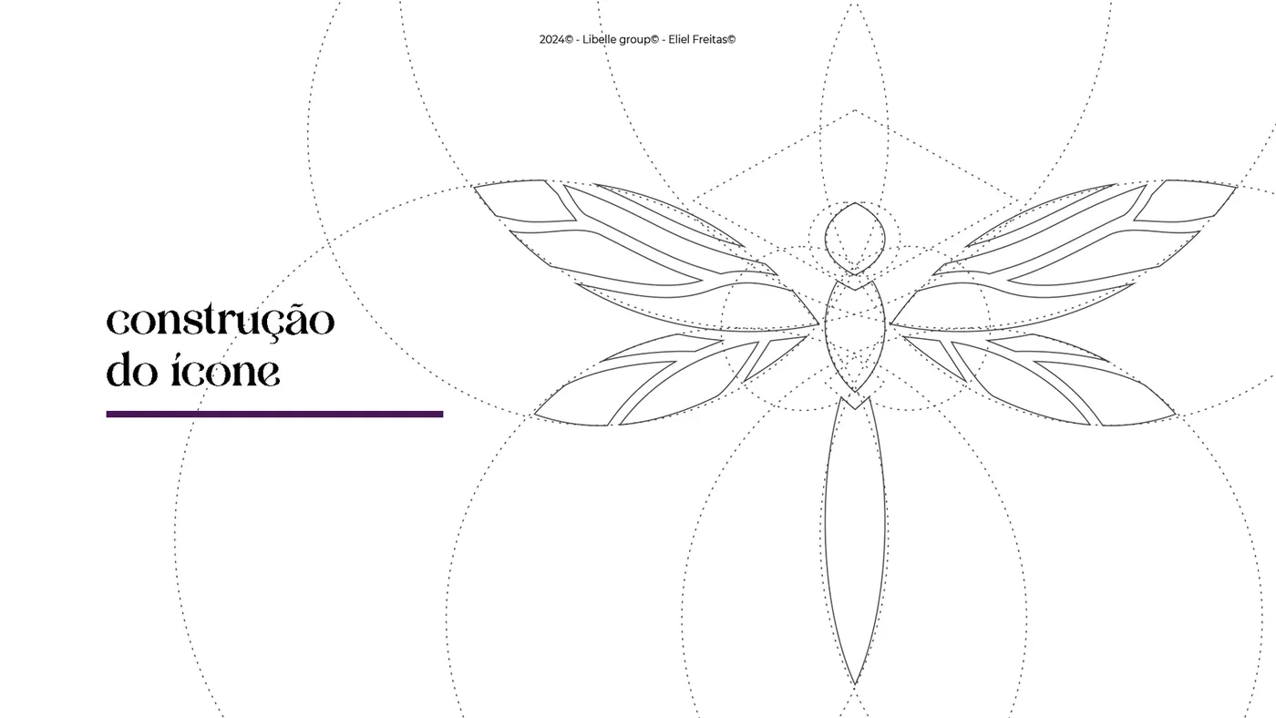
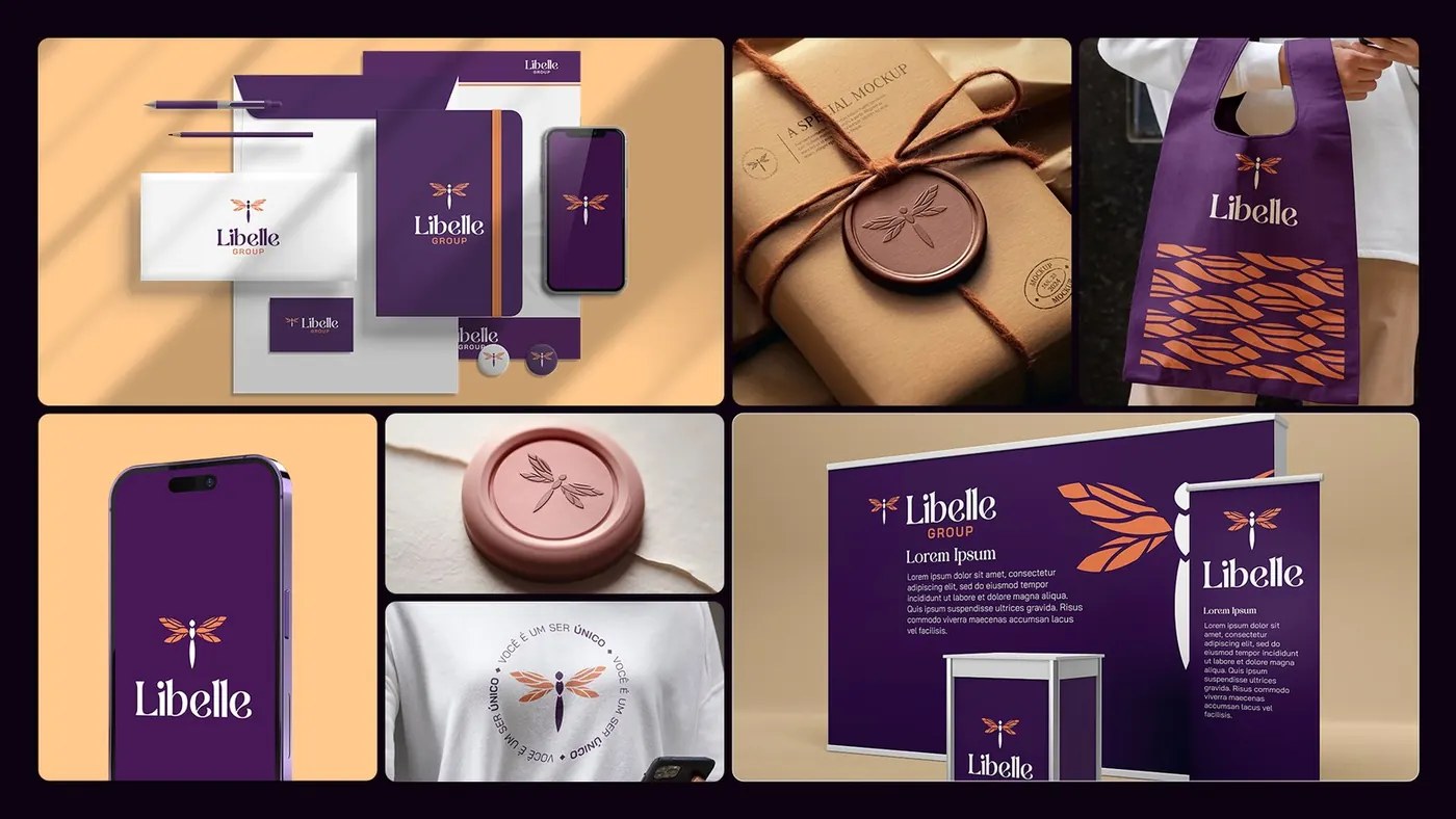
- The dragonfly, a symbol of transformation and rebirth, sits at the center of the brand.
- On the wing, a subtle fingerprint says that every woman is unique, and a root detail is a reminder that each one has her own stories and journeys.
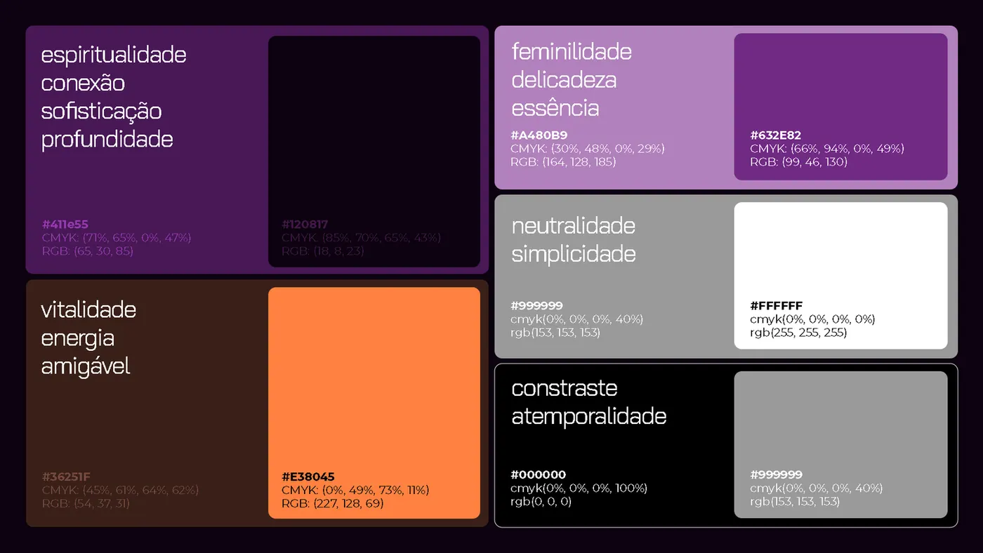
- Purples for femininity and spirituality, with orange for vitality. A brand that is friendly, human and transformative, never corporate or rigid.
Deliverables
- Brand presentation and mind maps
- Icon construction
- Horizontal and vertical logo
- Color palette and typography
- Brand guidelines and mockups
Strategy and direction: Arantho Design: Eliel Freitas

Varejo Tributário
Concept
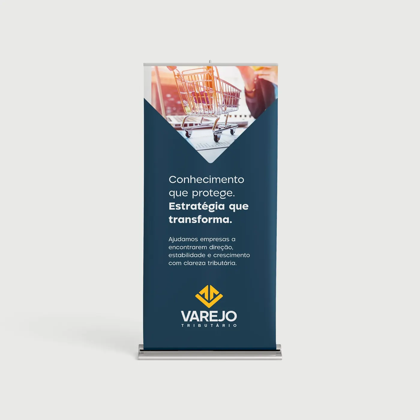
- Manifesto: turn tax chaos into clarity, bringing predictability, ethics and peace of mind to retail.
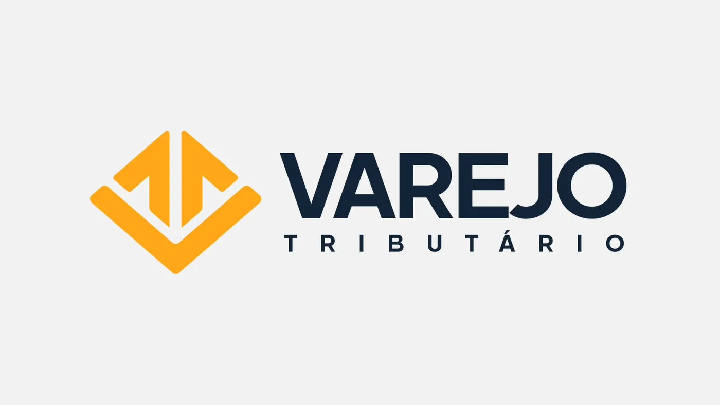
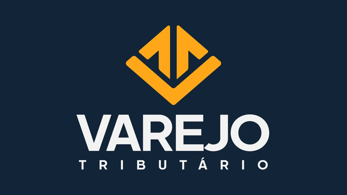
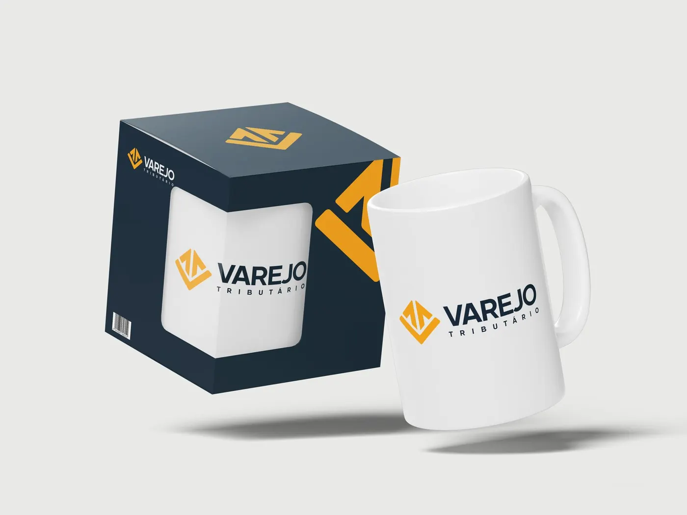
- In the symbol, the V base (for Varejo, “retail”) is the technical pillar, the T (for Tributário, “tax”) is the axis that guides, and an arrow rises from it, pointing up.
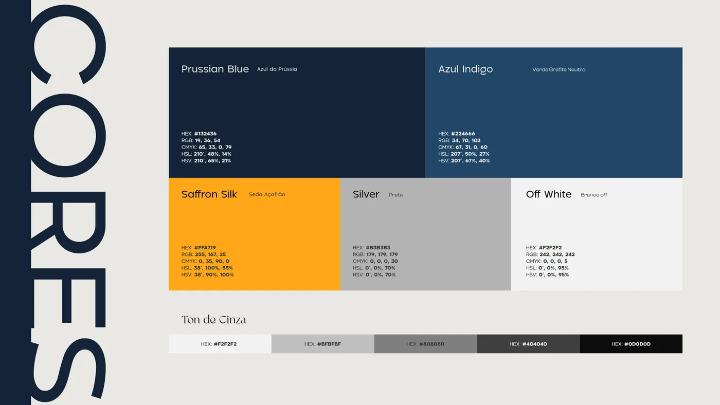
- Prussian Blue for quiet authority and Saffron Silk for the clarity that comes from knowledge.
Deliverables
- M.A.P.A. Diagnosis
- Brand presentation and manifesto
- Logo and icon
- Color and typography guide
- Mockups and signage
Palette
#132436#FFA719#224666
Strategy and direction: Arantho Design: Eliel Freitas and Mia Menegalli
A Ciência das Orquídeas
Concept
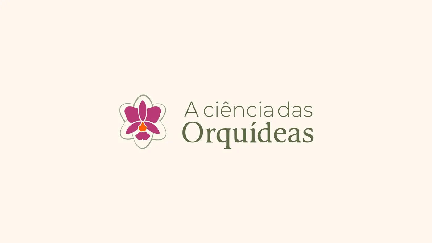
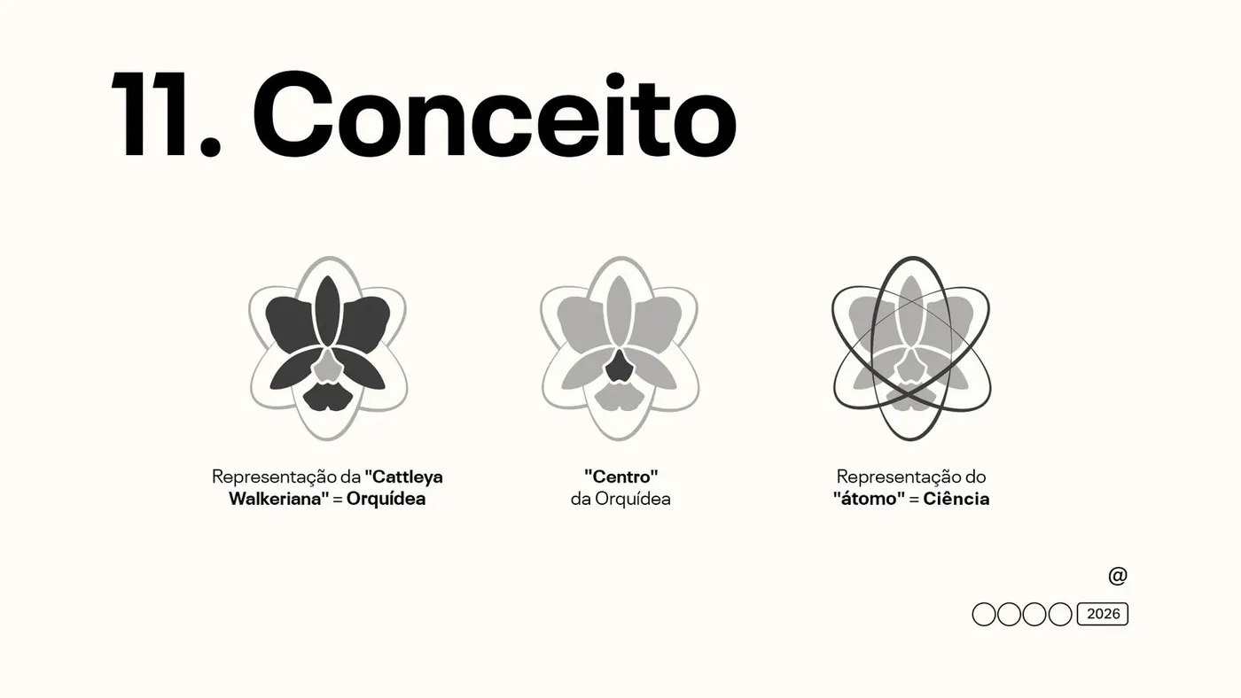
- The icon starts from the Cattleya walkeriana and takes on the outline of an atom, linking the brand to science and to the technical know-how of growing orchids.
- The atom highlights the flower's natural symmetry, as if each petal touched points on a circle.
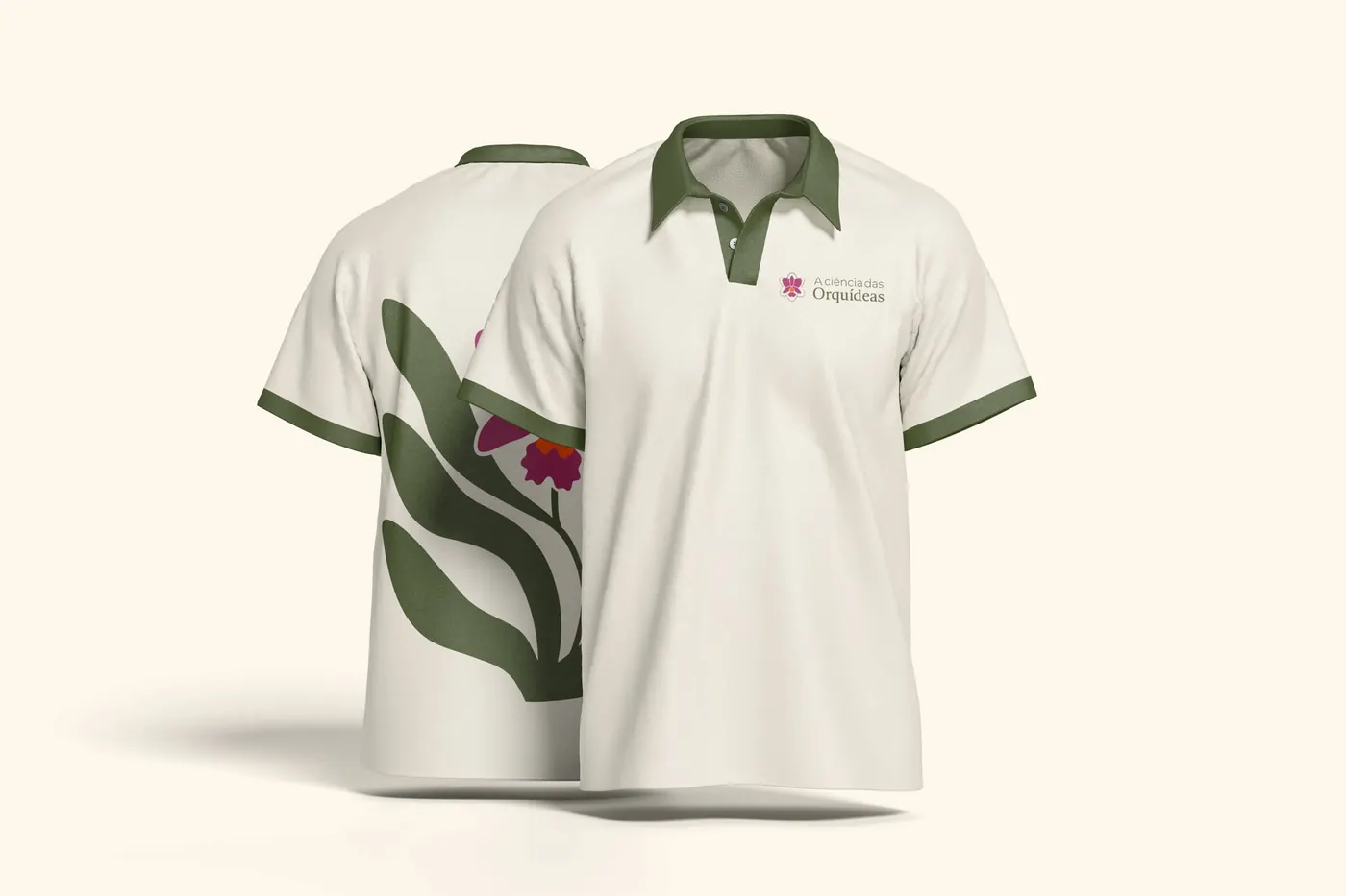
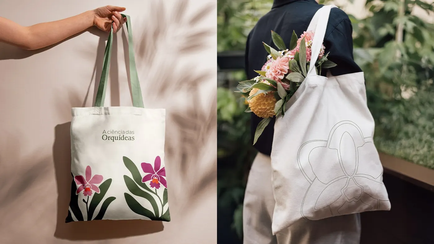
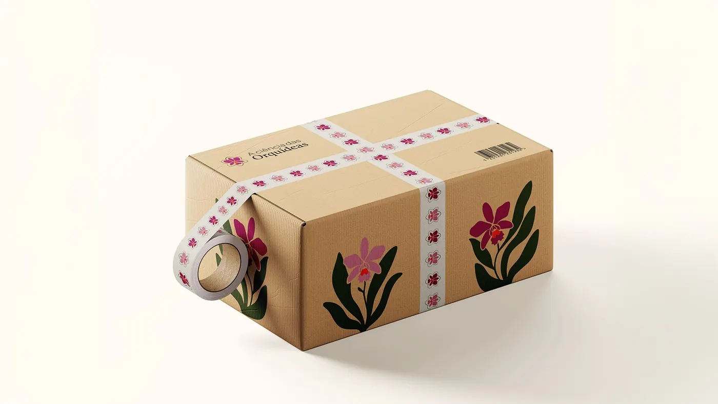
- A palette taken from the orchid itself: pink for beauty, green for nature and cultivation, orange for vitality.
Deliverables
- Visual identity presentation
- Positioning and tone of voice
- Logo and symbol in several colors
- Orchid illustrations and graphic elements
- Brand guidelines and mockups
Strategy and direction: Arantho Design: Moka Studio
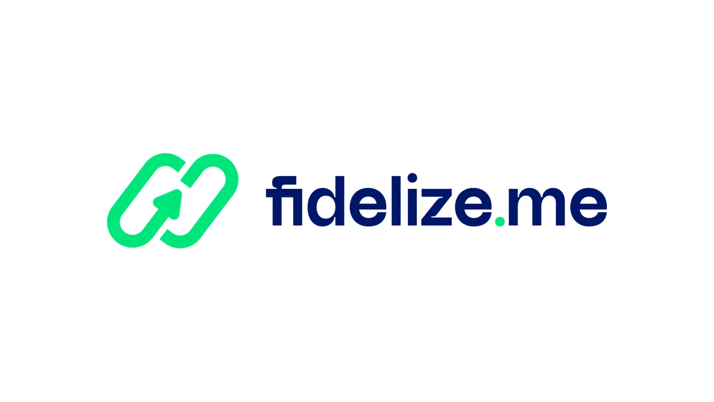
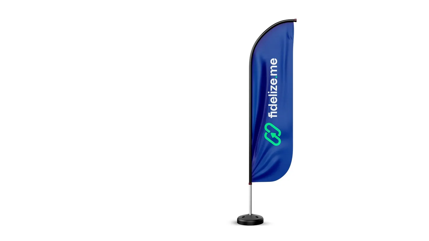
Fidelize.me
Concept
- Archetype triad: Sage at the core, Jester in the tone and Hero in support. A brand that teaches clearly, engages with a light touch and delivers with discipline.
- Tone of voice: keep it simple, back it with data and move people to act.
- The briefing in one line: where every customer comes back, and the business grows steadily.
Deliverables
- M.A.P.A. Diagnosis
- Archetype triad and tone of voice
- Instagram and TikTok profile architecture
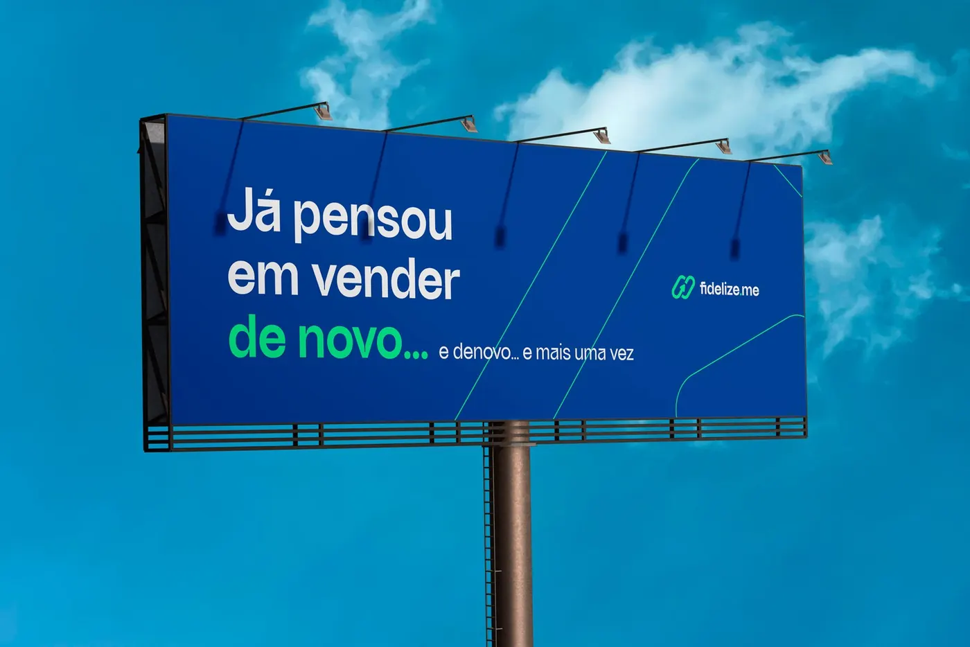
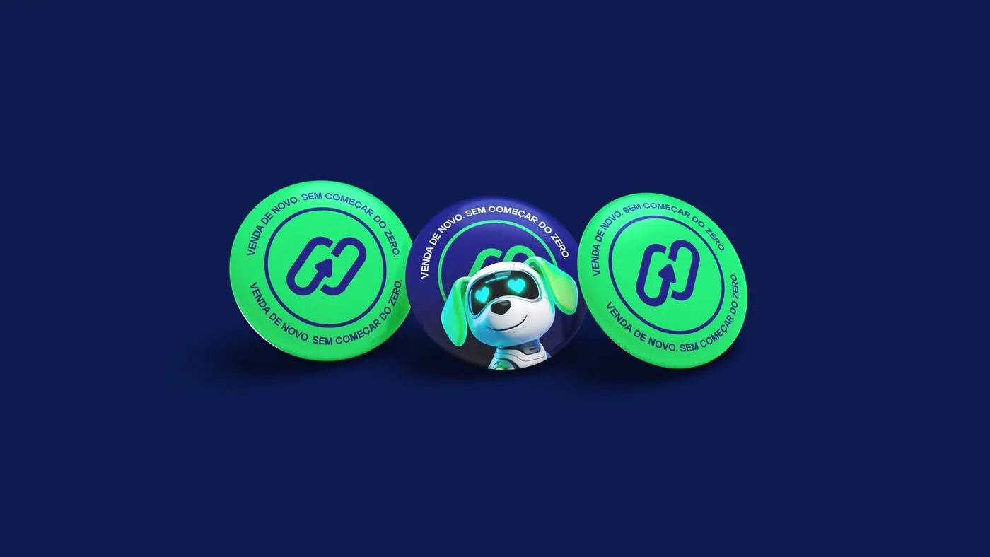
- Visual identity and the Fid mascot
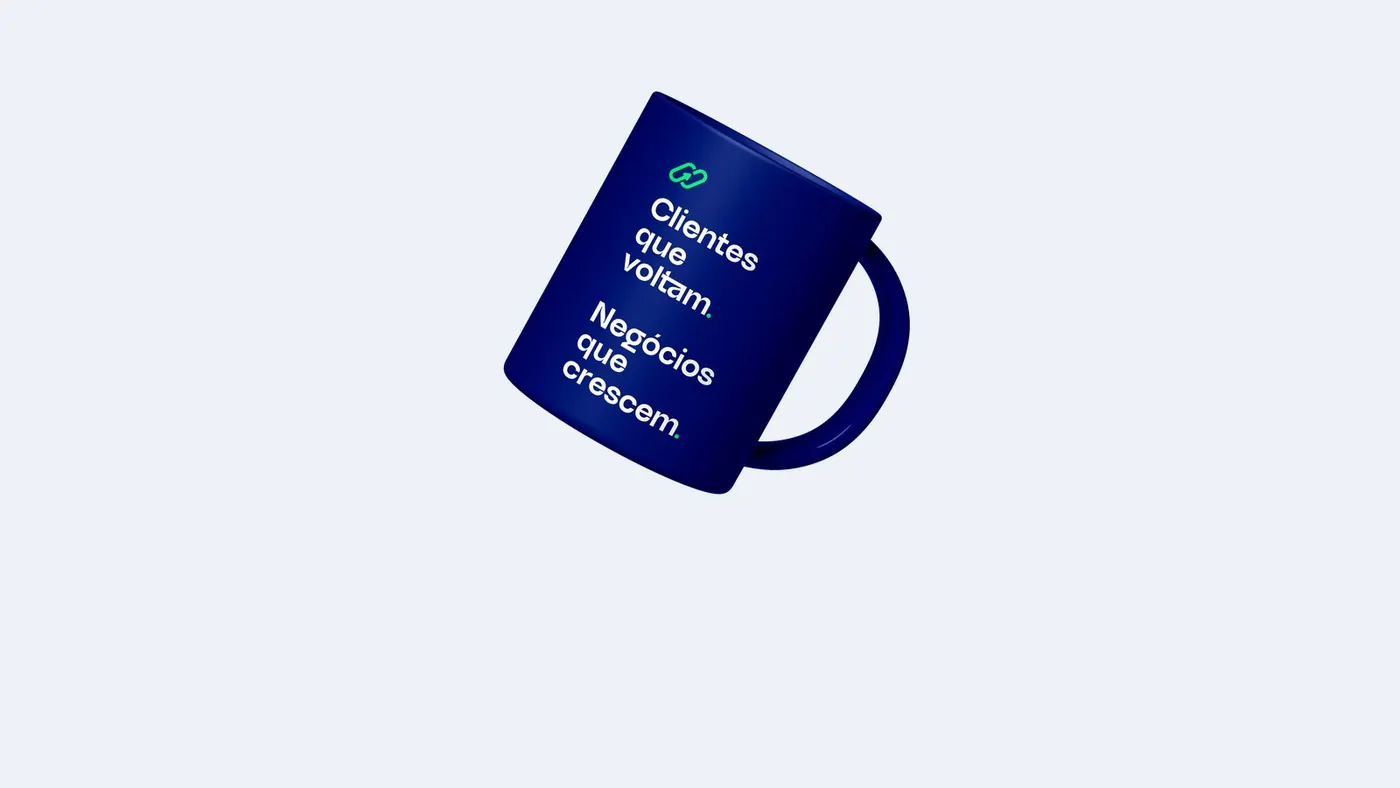
- Brand presentation and mockups
Strategy and direction: Arantho Design: Eliel Freitas
Saudações Financeiras
Concept
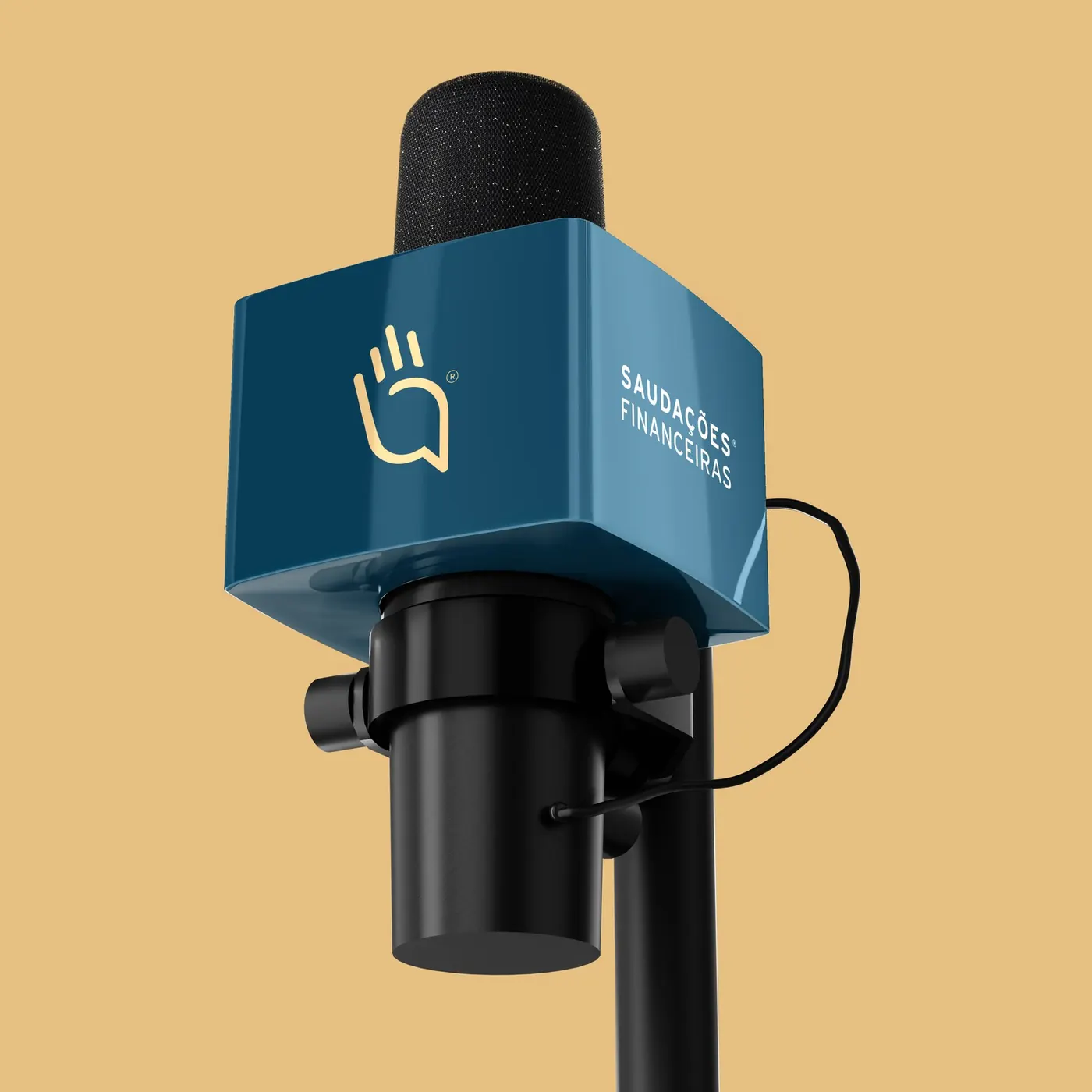
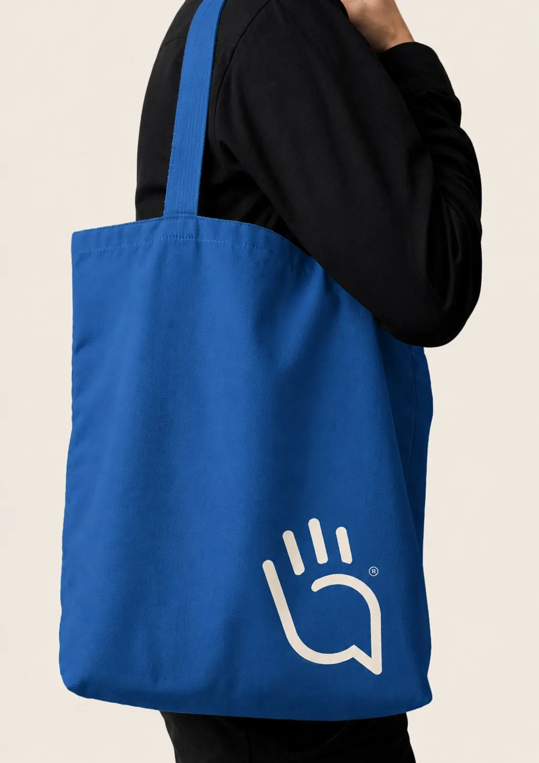
- The icon grows out of the word “saudação” (a greeting or salute), a universal gesture of recognition.
- The fingers become audio equalizer bars and the palm forms a speech bubble: a space for exchange, listening and connection.
- The challenge was to get away from the generic podcast look, without the microphone cliché. Caramel yellow brings warmth; navy blue brings credibility.
Deliverables
- Visual identity debriefing
- Positioning and tone of voice
- Logo and symbol
- Color palette and typography
- Brand identity guidelines and mockups
Strategy and direction: Arantho



Livato Consultoria
Concept
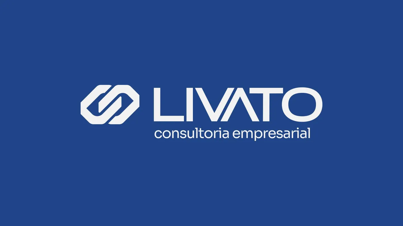
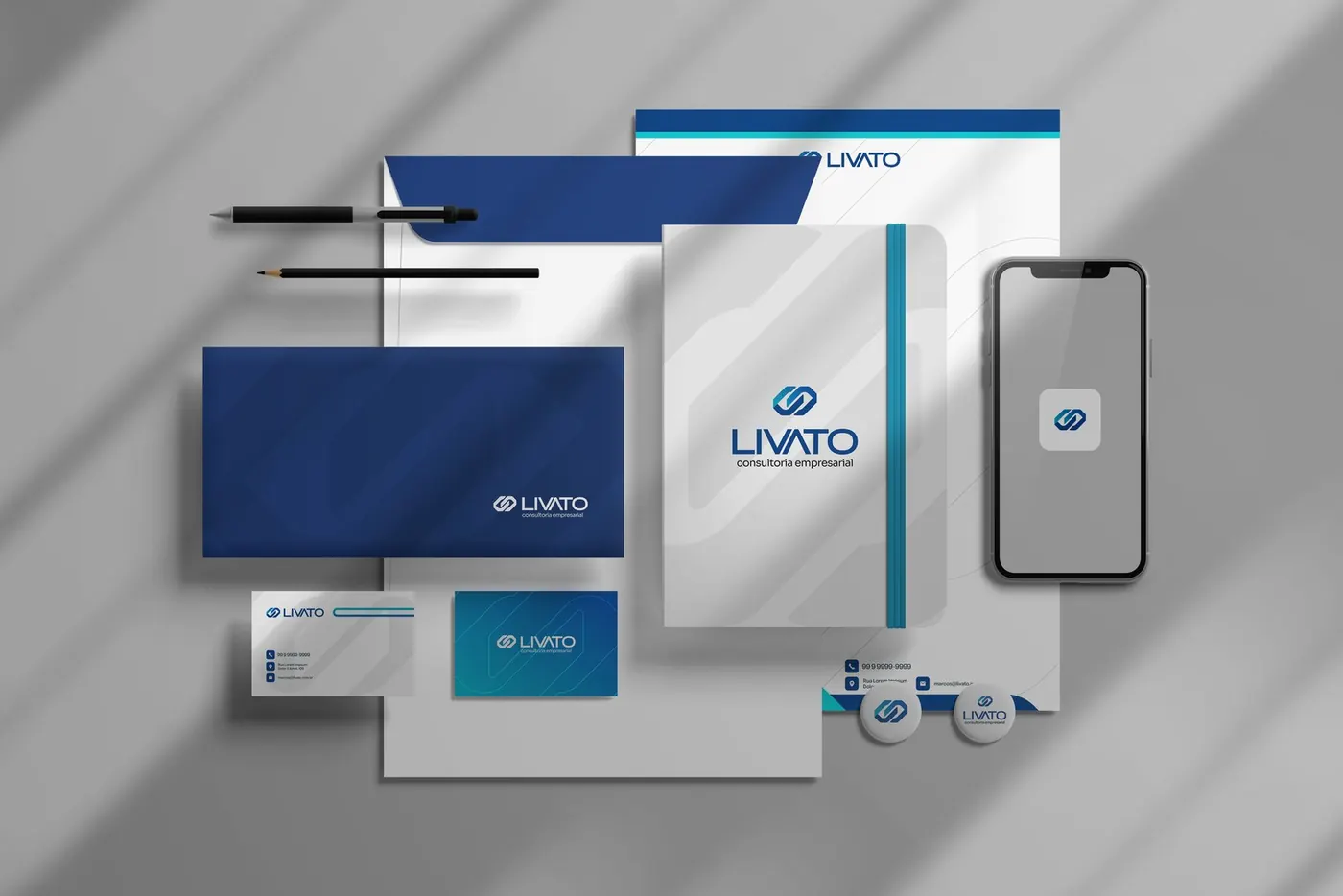
- The symbol joins two check marks: a double confirmation that reinforces trust, validation and excellence.
- The structure hints at the founder's M, like a discreet visual signature, and the interlocking shapes create a link between the firm and its clients.
- Manifesto: no important decision should be made in the dark.
Deliverables
- Brand presentation and manifesto
- Logo and symbol
- Palette and color guide
- Typography
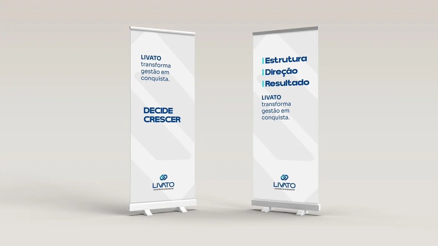
- Stationery, signage and social media mockups
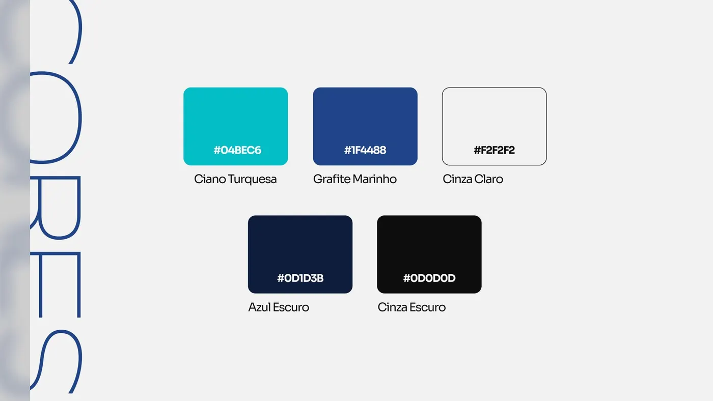
Palette
#04BEC6#1F4488
Strategy and direction: Arantho

De Biagi Ótica Boutique
Concept
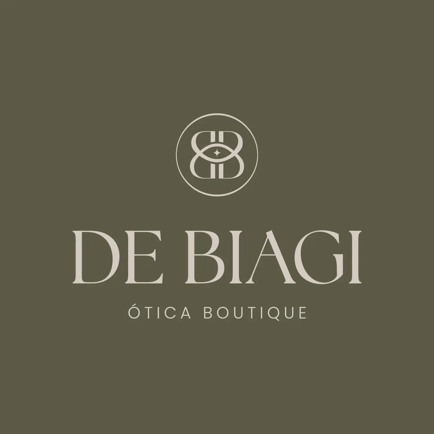
- After many years as Ótica USI, the store got a brand of its own that brings tradition and modernity together in accessible luxury.
- The symbol is a monogram in which the letter B forms an eye, with a sparkle that suggests exclusivity: it evokes eyewear without stating the obvious.
- Green as the main color, elegant and comfortable; fendi for sophistication; a serif typeface for tradition.
Deliverables
- Identity questionnaire and briefing
- Positioning, mission, vision and values
- Logo, monogram and print pattern
- Color palette and typography
- Brand guidelines
Strategy and direction: Arantho
Aline Vicente
Concept
- The icon joins the initials A and V in the shape of a rose, a symbol of valuing life, wrapped in a shield of protection and care.
- Positioning: protection with purpose. Protecting what matters most with sensitivity and trust.
- A feminine touch to stand apart from the sameness of the industry without losing authority: dark blue as the base and beige for elegance.
Deliverables
- Visual identity rebrand
- Brand platform and positioning
- Logo versions and symbol
- Palette, typography and graphic patterns
- Print materials and Instagram highlights
Strategy and direction: Arantho

Grupo Rarah
Concept
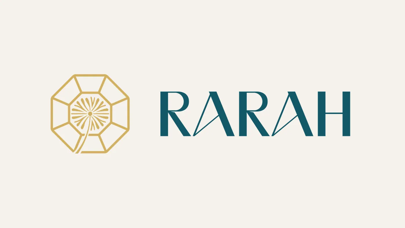
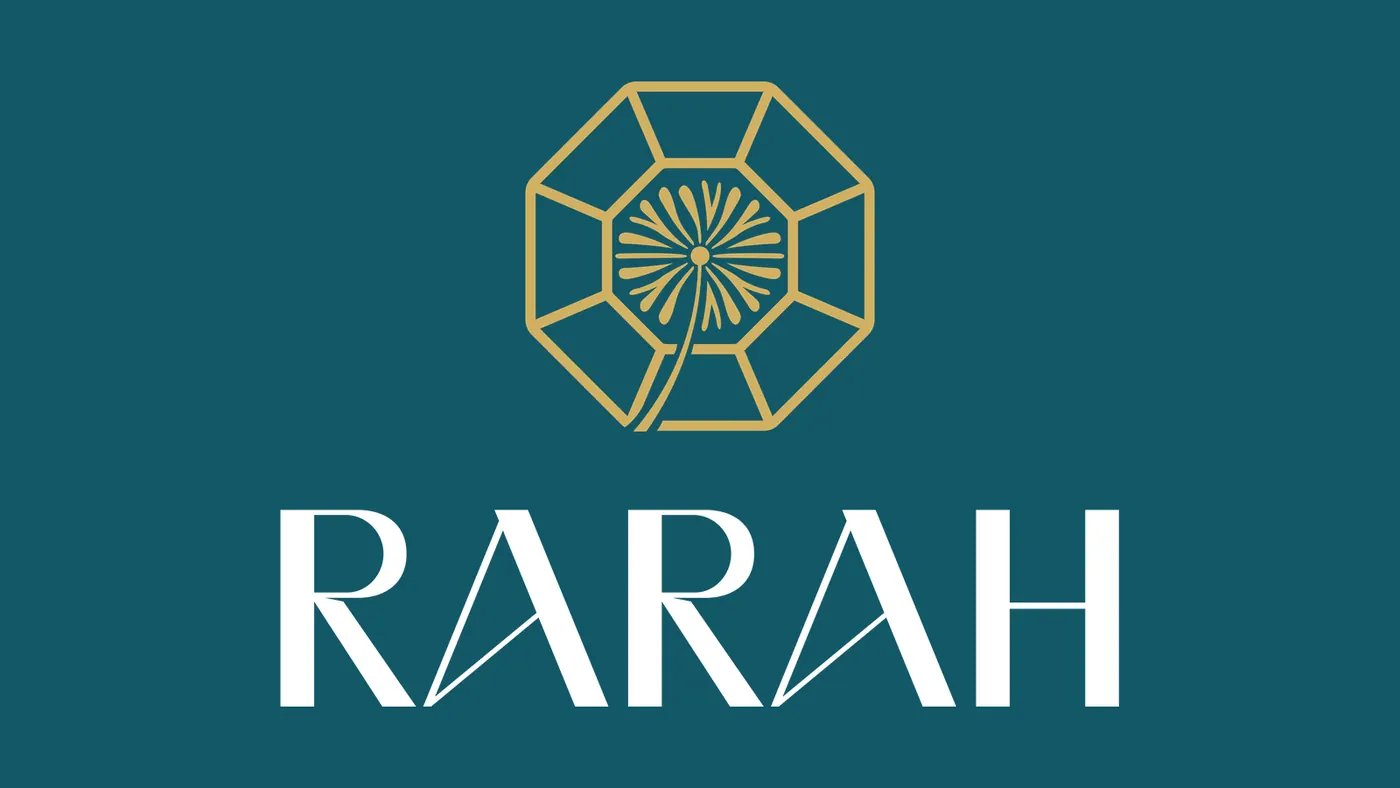
- The name was created from scratch: RARAH evokes what is rare (“raro” in Portuguese), precious and transformative, like a stone cut and polished until it reaches its full brilliance.
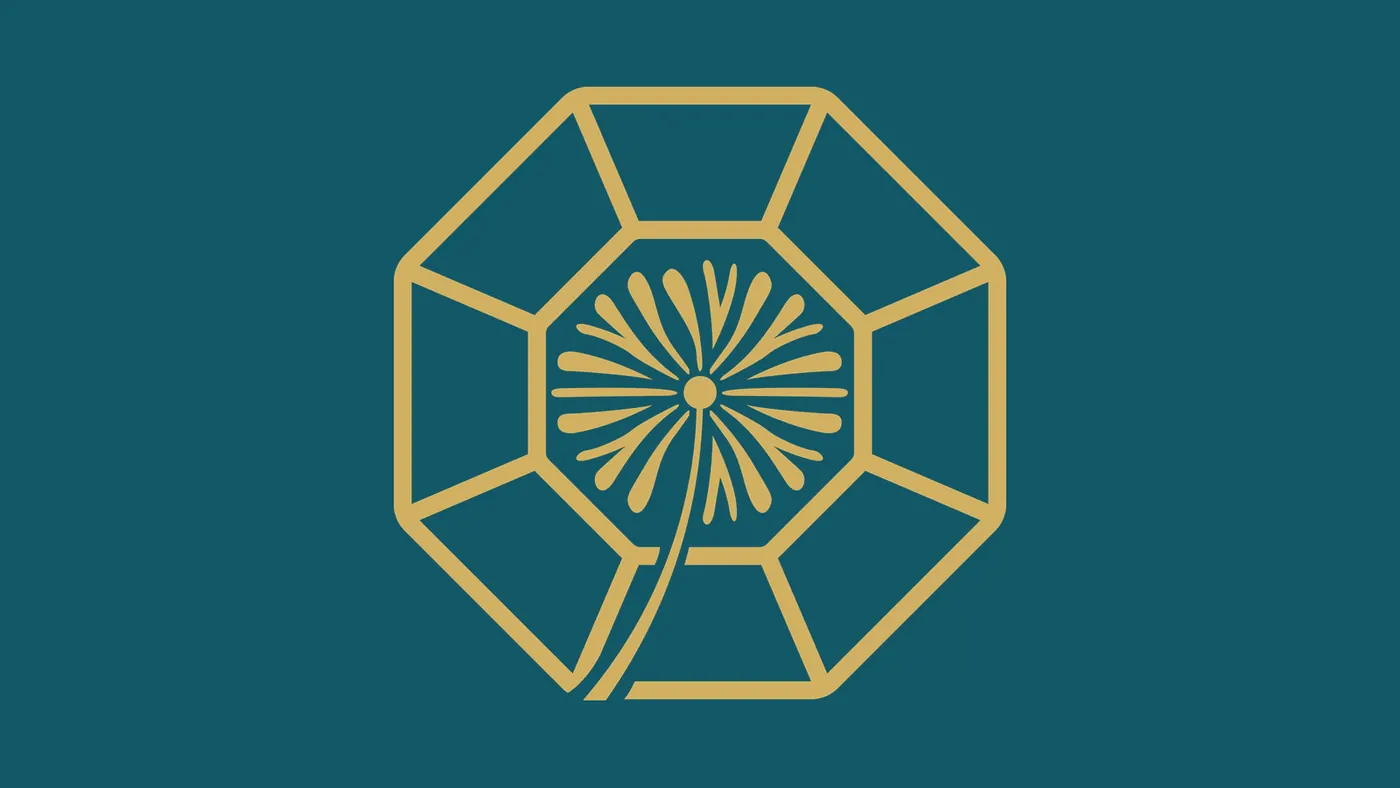
- The icon brings together three ideas: the diamond (resilience, formed under pressure), the dandelion (continuous growth) and the eye (seeing the essence of each person).
- Reval typeface, modern and elegant, paired with Nomixa for easy reading.
Deliverables
- Naming
- Purpose and mission
- Brand mind map
- Logo and icon
- Palette, typography and digital applications
Strategy and direction: Arantho
Leticia Nunes Healing Nutrition
Concept
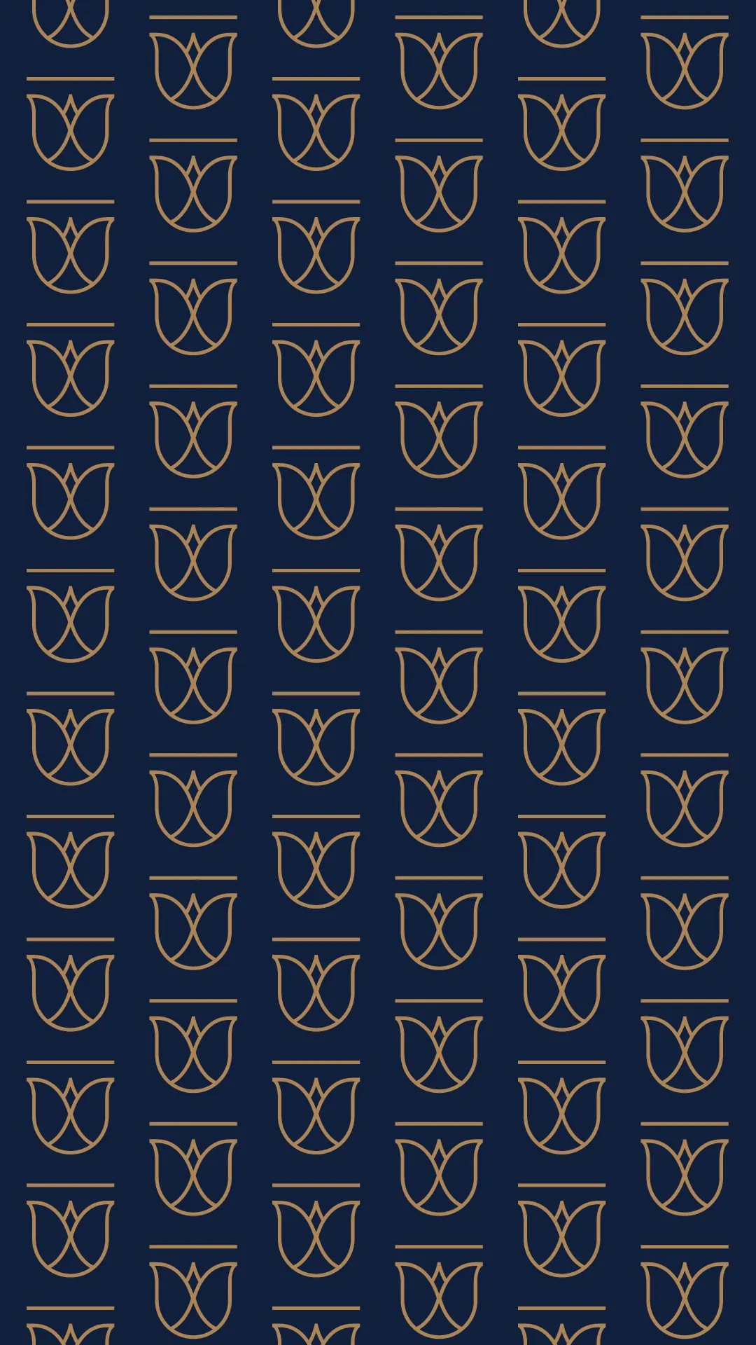
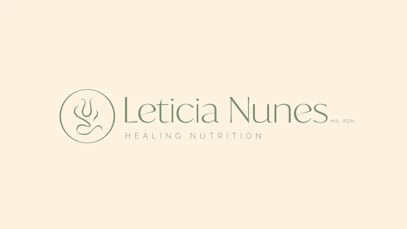
- The initials L and N were stylized as a tulip, a symbol of rebirth and transformation on the journey toward health.
- Greens and sand tones convey calm and care, with a sense of sophistication.
- Communication tagline: “Feed your body and soul.”
Deliverables
- Visual identity presentation
- Tone of voice, mission and values
- Logo mark and its construction
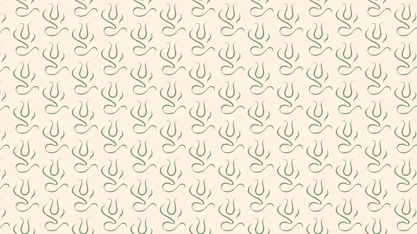
- Palette, typography and graphic pattern
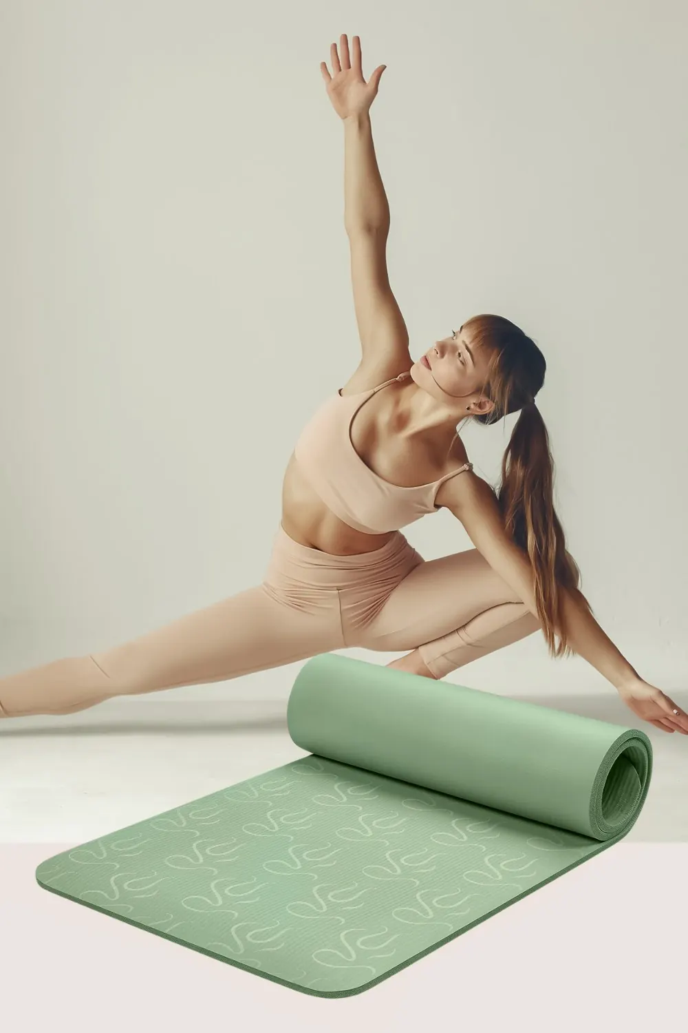
- Social media, print materials and mockups
Strategy and direction: Arantho


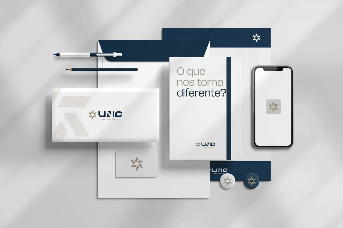
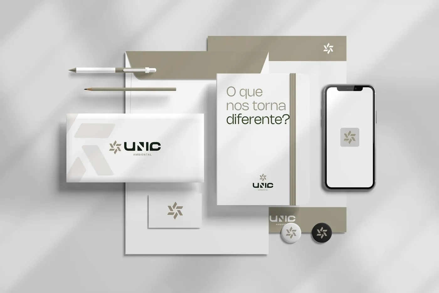
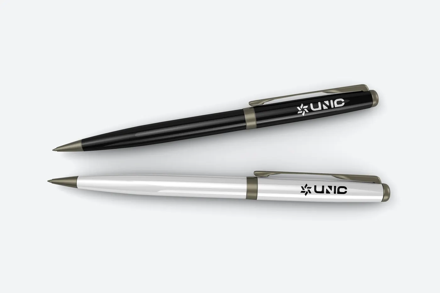
UNIC Engenharia
Concept
- The icon combines a geodesic dome (solidity and technical expertise), a hexagram (different areas working as one) and a wind vane (direction, movement and progress).
- A single identity organizes three units: Engineering, Environmental and Occupational Safety.
- Brand pillars: innovation, transparency and sustainability.
Deliverables
- Brand presentation, personas and pillars
- Icon concept and construction
- Logo and its versions
- Color palette and typography
- Applications for the three business units
Strategy and direction: Arantho Design: Eliel Freitas
Rabisco Papelaria
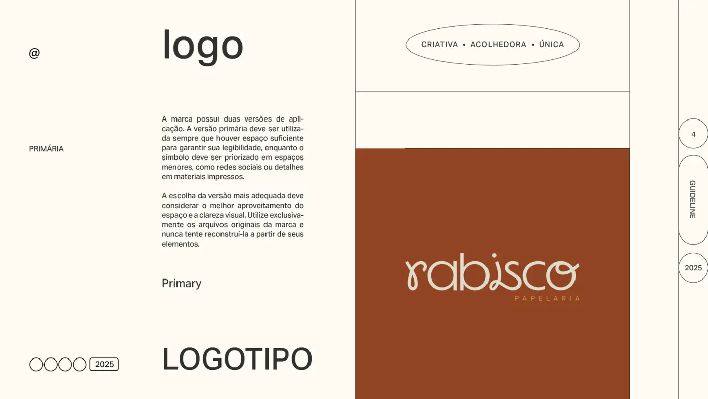
Concept
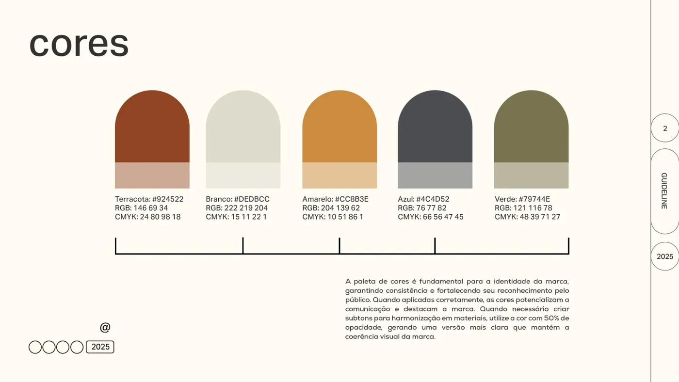
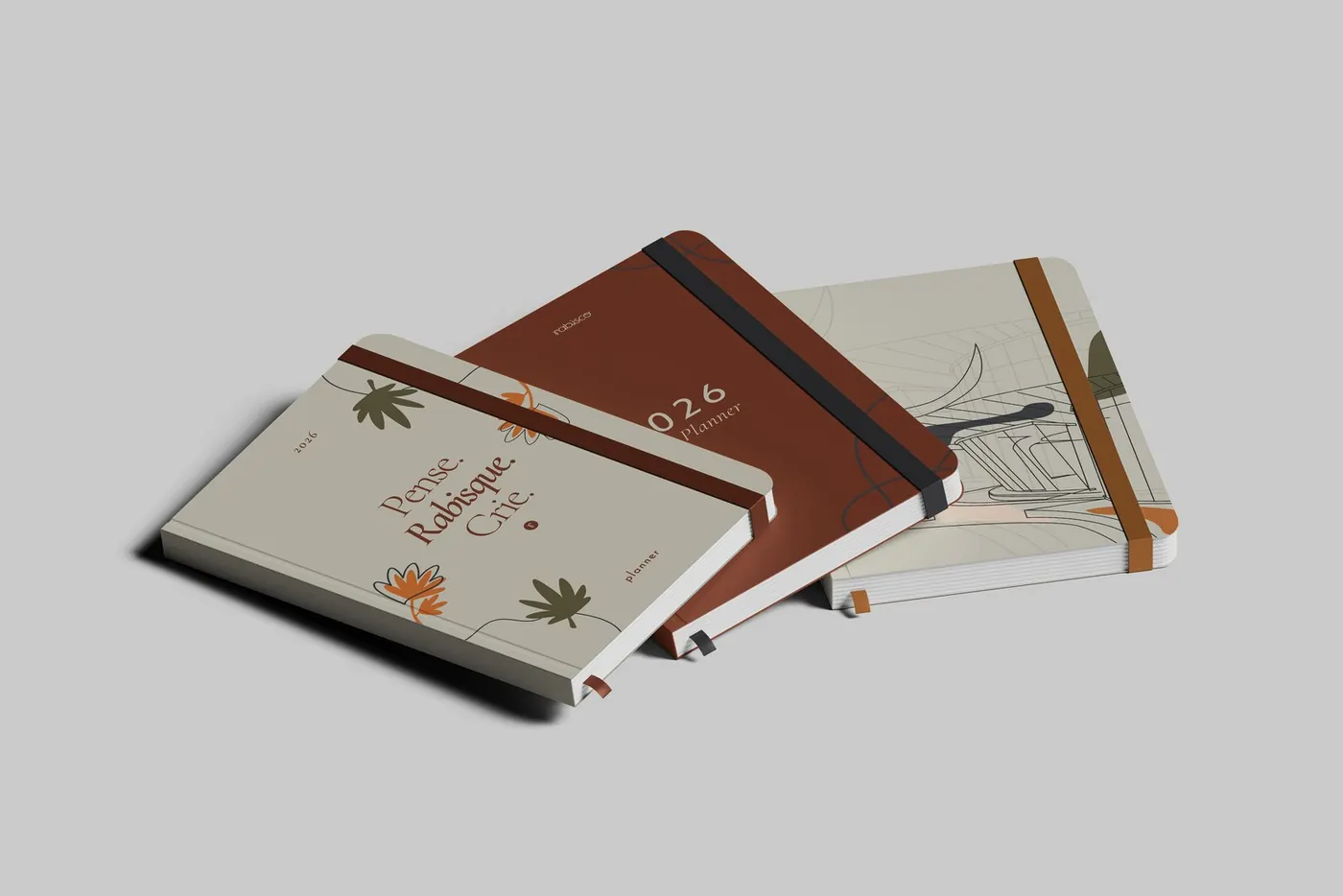
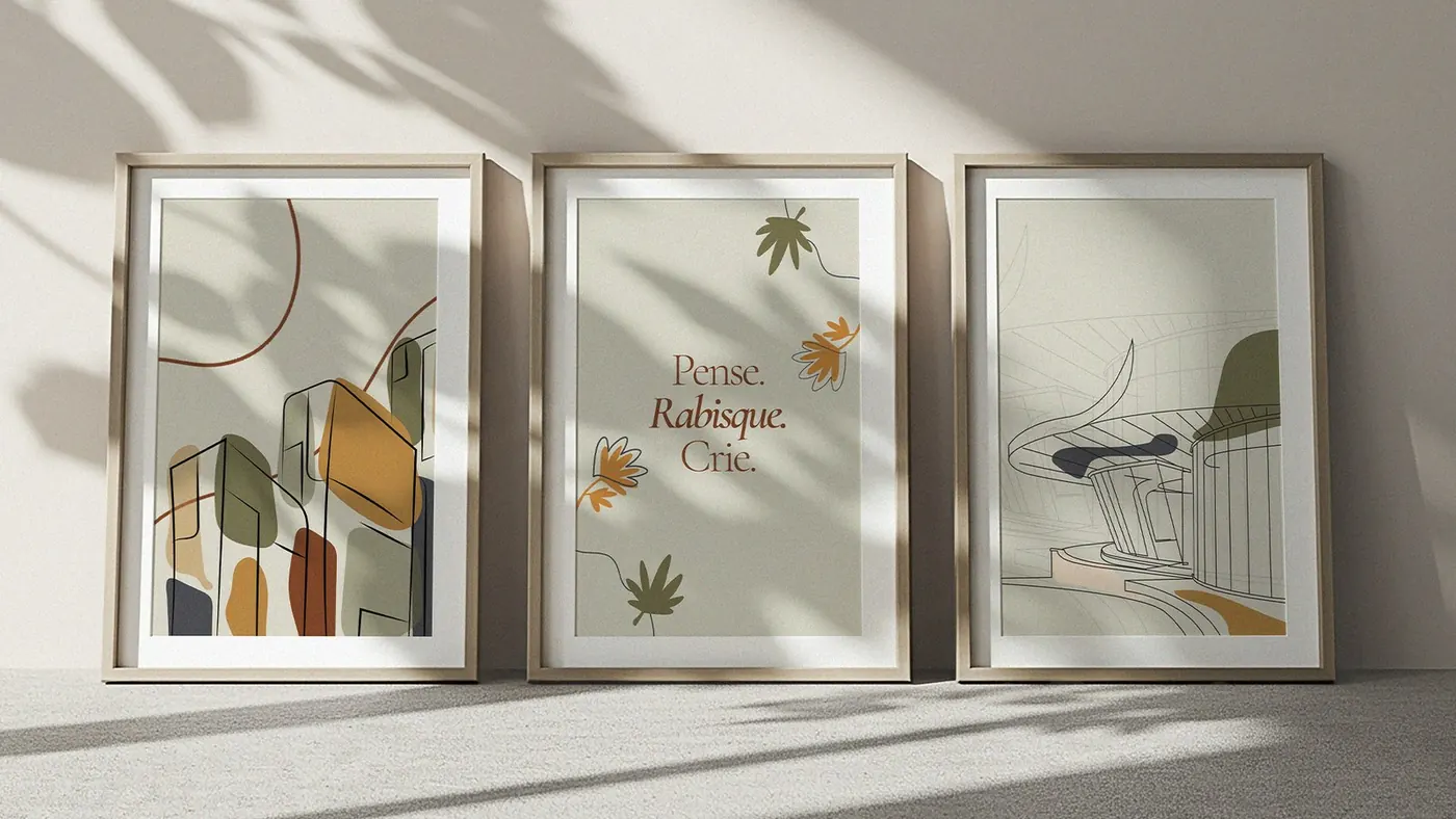
- A brand created by architects for architects, with a direction inspired by boho style: earthy colors and organic shapes.
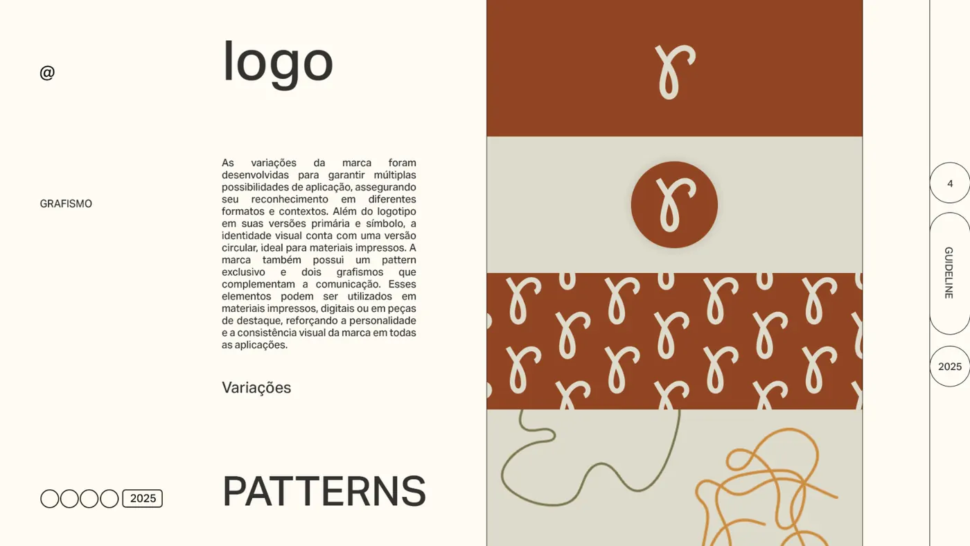
- A pattern and graphic elements drawn with a scribbled stroke (“rabisco” means scribble) reinforce a creative, welcoming and one-of-a-kind personality.
- A friendly, creative and approachable tone of voice, written in the first person.
Deliverables
- Brand guide, persona and tone of voice
- Logo, symbol and circular version
- Pattern and graphic elements
- Color palette and typography
- Mockups and social media assets
Strategy and direction: Arantho
SW Manifesto
Concept
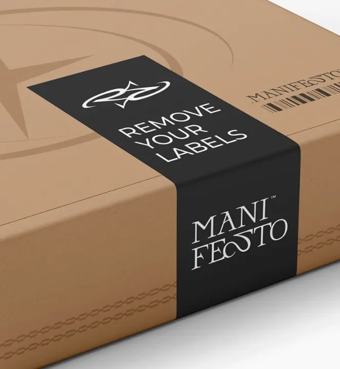
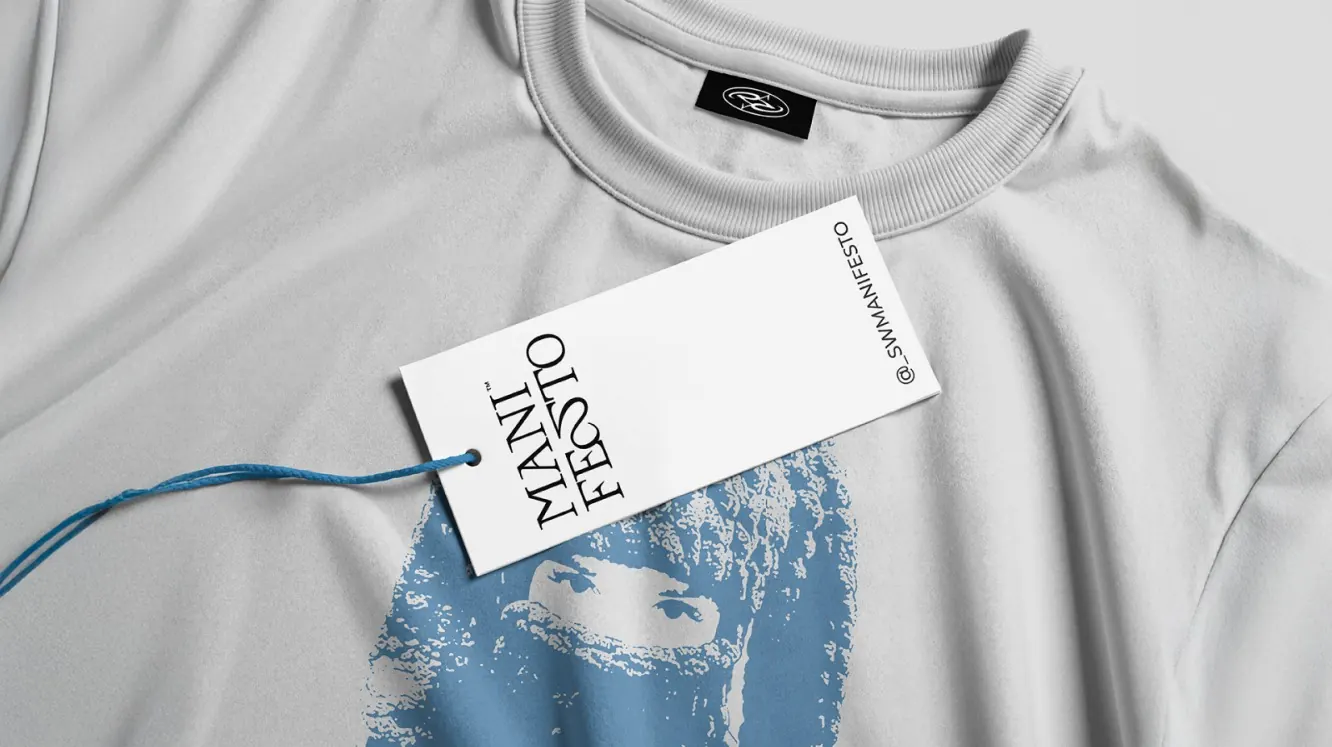
- Manifesto as a way of breaking patterns and expressing style, not as aggressive rebellion.
- Archetypes: Creator at the core, Caregiver in the tone of voice and Outlaw as the differentiator: no labels, just you.
- A minimalist postal vocabulary: an order becomes “Arquivo nº” (File no.), shipping becomes “Postagem” (Mailing) and the customer becomes “Destinatário” (Recipient).
Deliverables
- M.A.P.A. Diagnosis
- Positioning, archetypes and persona
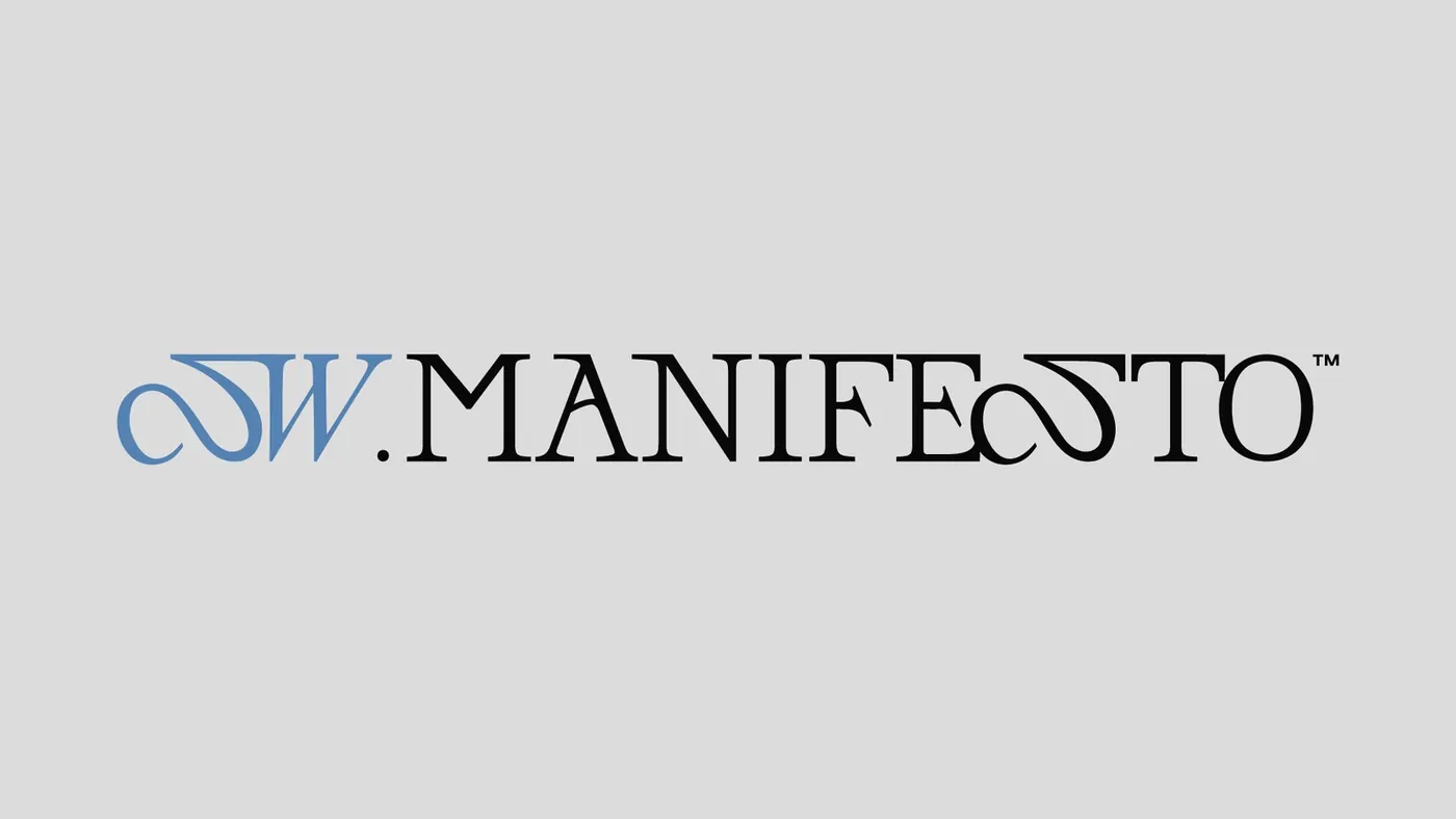
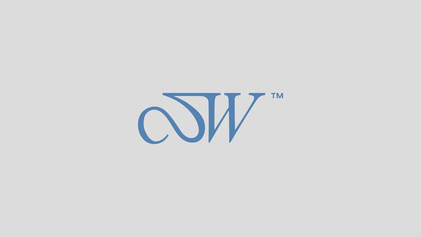
- Logo, monogram and symbol
- 3D versions and Instagram highlight icons
- Brand vocabulary
Strategy and direction: Arantho

Your brand cantell the right story too.
Positioning comes before the logo. The M.A.P.A. Diagnosis is the first step toward an identity that makes sense for your business.
Get my diagnosisA 20-minute call, no sales pitch. If it isn't a fit for you, we'll tell you right away.
Have a question first? Message us on WhatsApp.